BugFeatures MARQUE agent
Logo · Emblem · Symbol · Brand Identity

Give a name
its mark.

Logos, emblems and symbol-led brand identity. We start with a hand sketch and show you construction, refinement, color and application mockups on a single board. Brands remembered by form, not just by letters. A brand name is all you need to start.

20+Years AD
40+Emblem Concepts
3Directions First
Logo DesignEmblem & CrestSymbol SystemBrand IdentityWordmarkColor PaletteApplication MockupVector Delivery · AI · SVG Logo DesignEmblem & CrestSymbol SystemBrand IdentityWordmarkColor PaletteApplication MockupVector Delivery · AI · SVG
SKETCH — PENCIL & COMPASSIt starts by hand. Until a single line becomes a symbol.
01 — SERVICES

Form remembered
before the letters.

A good emblem is recognizable when shrunk, printed in one color, or seen from across the room. We build the symbol first and lay the name and color on top. Sketch → construction → refinement → color → application — five stages, reviewed on one board.

01

Logo & Emblem Design

Logo & Emblem

Symbol-led logos and round, shield and badge emblems. We present three directions suited to your industry and tone, then refine the chosen one on construction lines.

  • Symbol · Emblem · Crest
  • Wordmark · Lettermark
  • Three directions first
  • Mono · Reverse · Small-size tests
02

Brand Identity Kit

Identity System

Color palette, type pairing, clear-space rules and misuse examples. A basic guide delivered with mockups ready for business cards, packaging, signage and social profiles.

  • Color & type system
  • Application mockup set
  • Mini guideline PDF
  • Social & favicon specs
03

Vectorize & Redesign

Vectorize & Refresh

Vectorizing, cleaning up and modernizing existing logos. Versions for print, engraving, embroidery and signage, plus a black-and-white master for trademark filing.

  • AI · SVG · PDF · PNG
  • Media versions (engraving · embroidery)
  • Existing logo refresh
  • Trademark search guidance
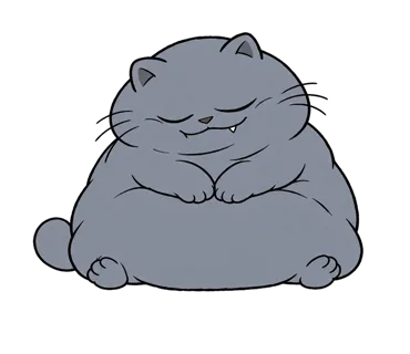
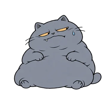
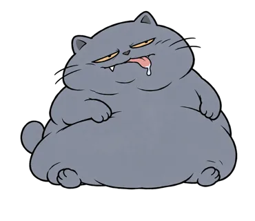
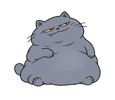
CHARACTER — EMOTICON SETS

Characters that
carry a feeling.

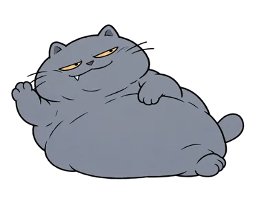
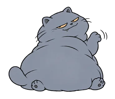
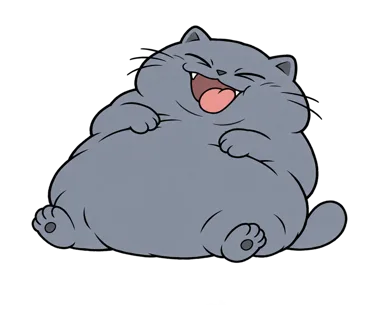
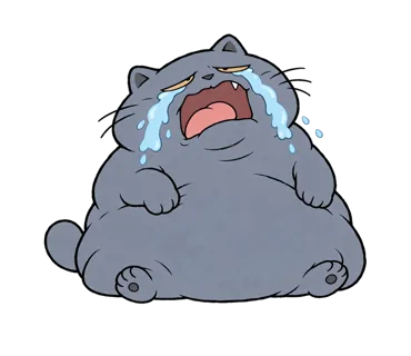
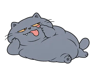
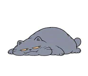
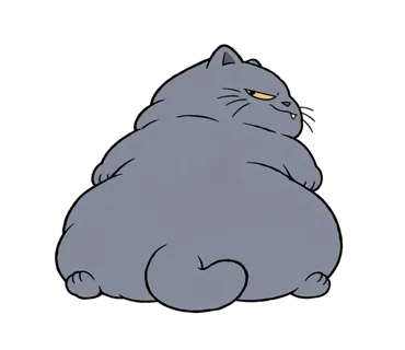
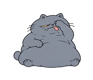
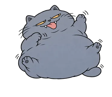
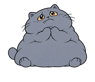
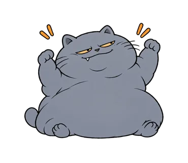
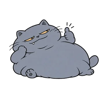
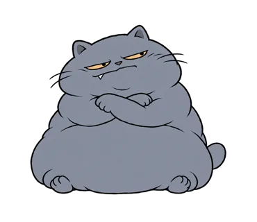
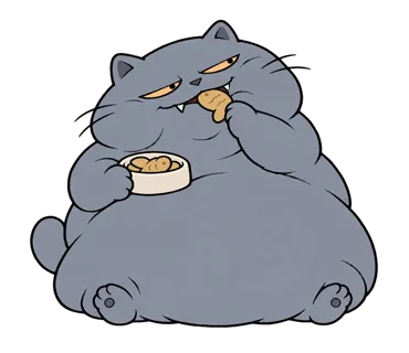
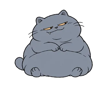
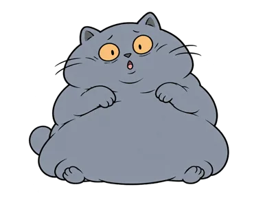
Original characters built for messenger sticker stores. Each set is one character in 20–24 reactions — expression, pose and silhouette tuned to read at thumbnail size. Seven sets, 164 stickers.

ILLUSTRATION — PICTURE BOOK · PUBLISHED BOOK · FICTION

Pictures that
carry a story.

Three tones from one studio: bright picture-book scenes for learning, graphite plates printed in a published book, and quiet pencil-and-wash scenes for fiction. Each set keeps one character, one palette and one line weight from first page to last.

01 — PICTURE BOOK & EDUCATION

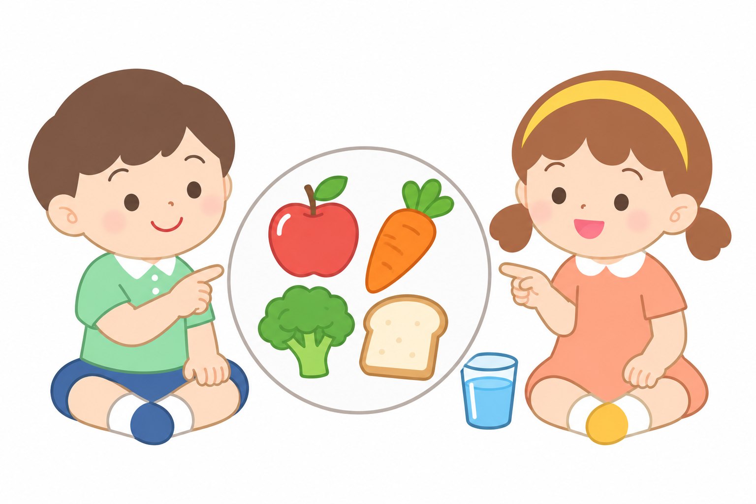
Illustration that teaches gently.

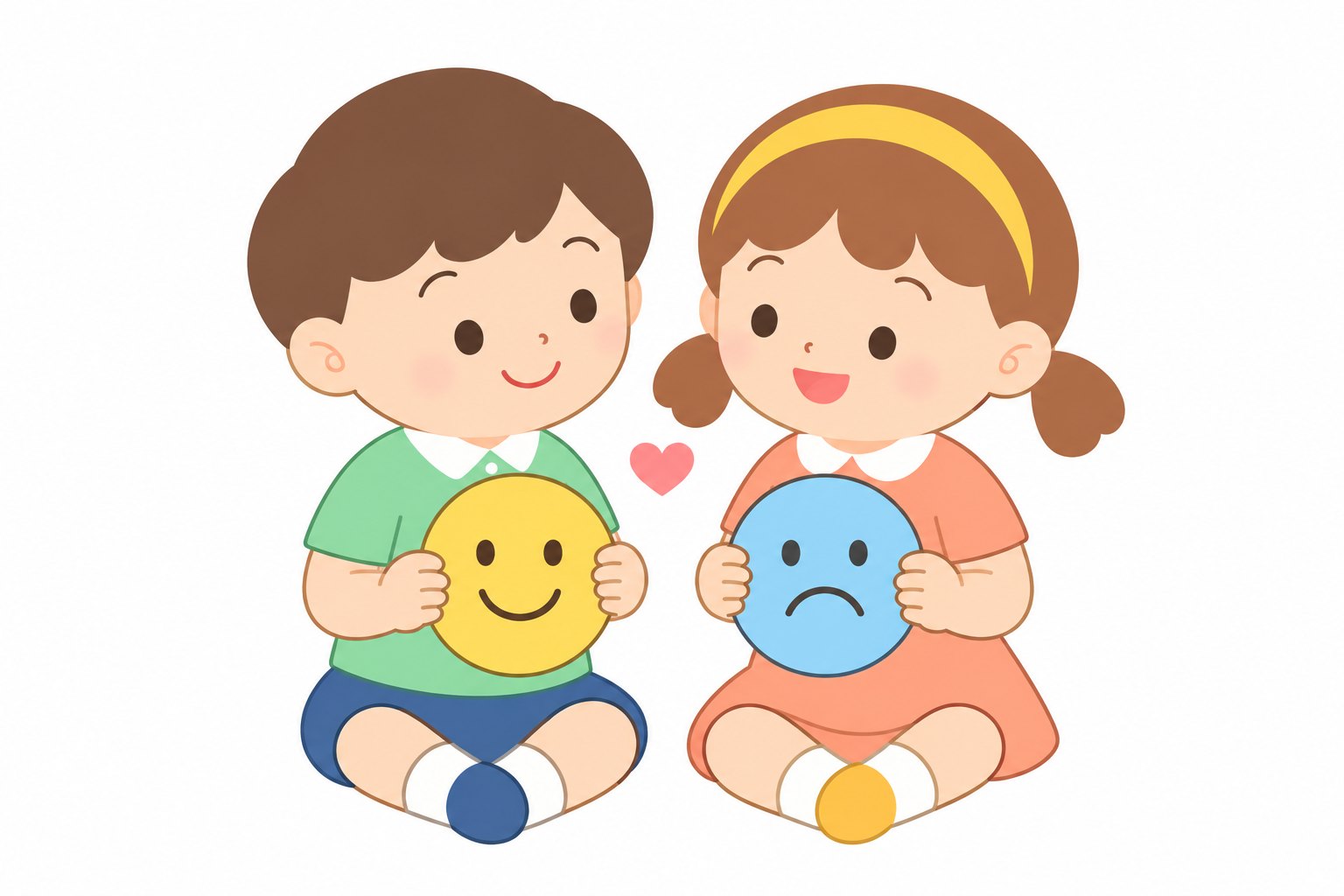
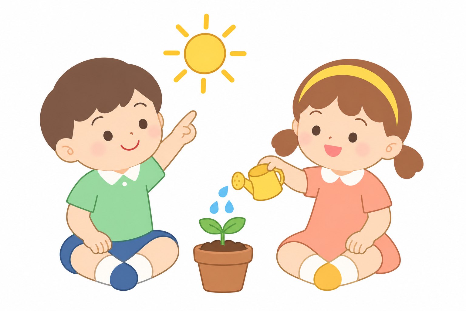
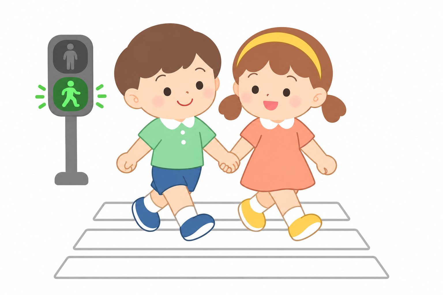
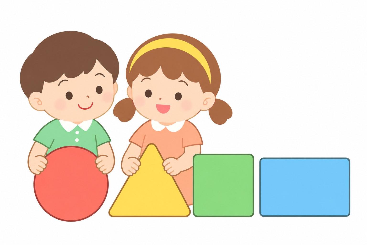
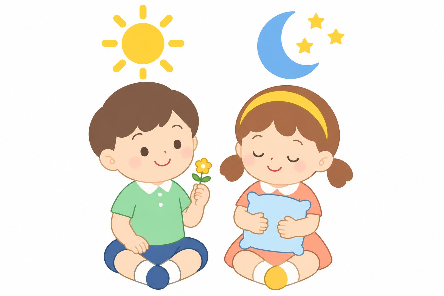
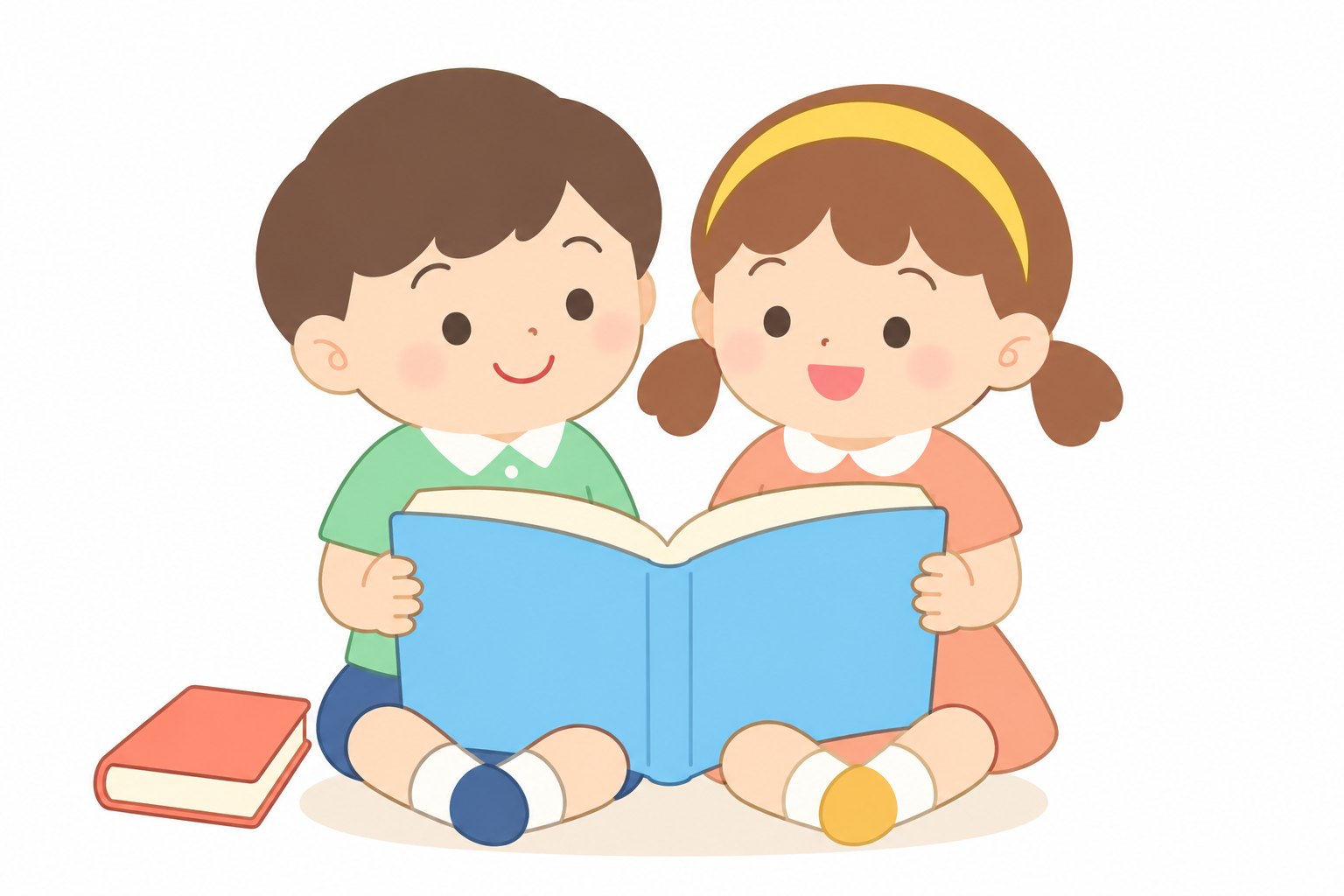
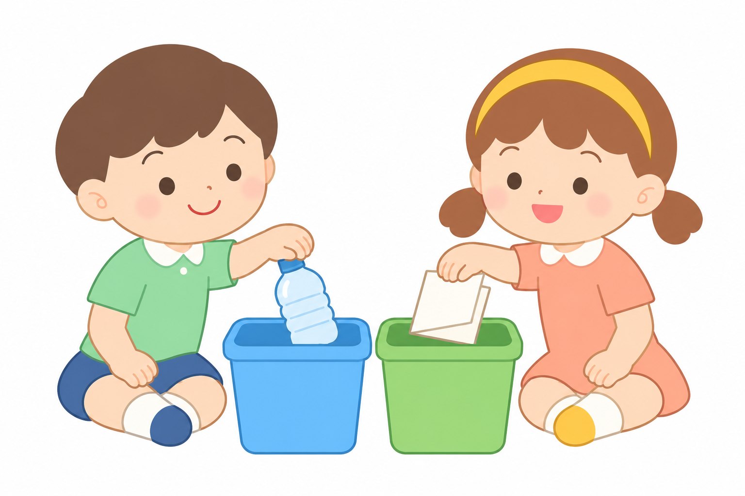
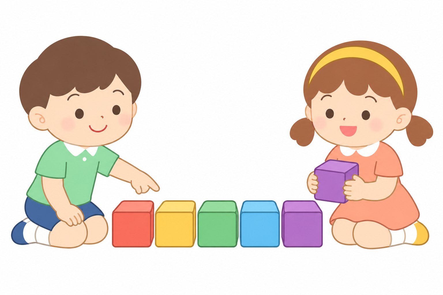
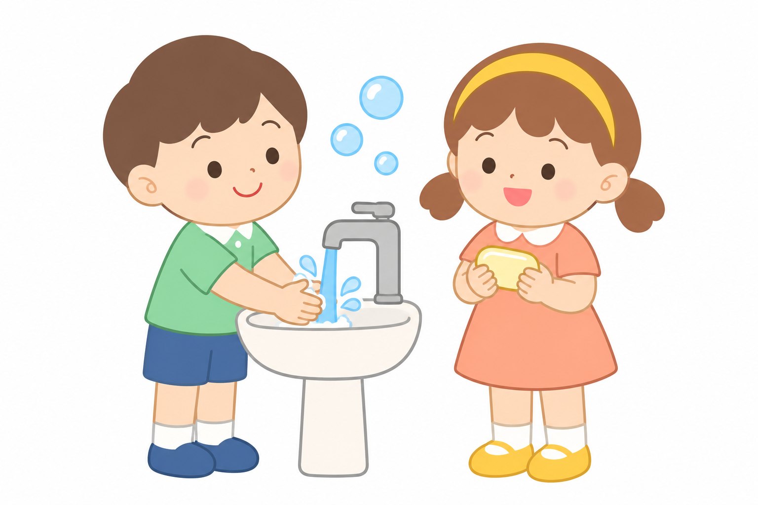
One pair of characters carried through ten learning scenes — food, feelings, nature, safety, shapes, time, reading, recycling, colors and hygiene. Built for picture books, worksheets and classroom posters.
02 — PUBLISHED BOOK · AS PRINTED

『AI는 왔는데 조직은 오지 않았다』

“AI Arrived. The Organization Didn’t.” — Kyu Suk Seo · A5 essay

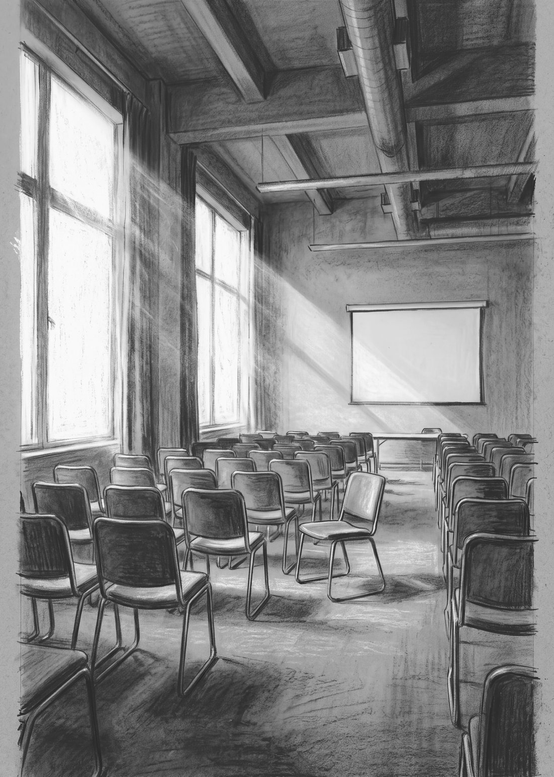
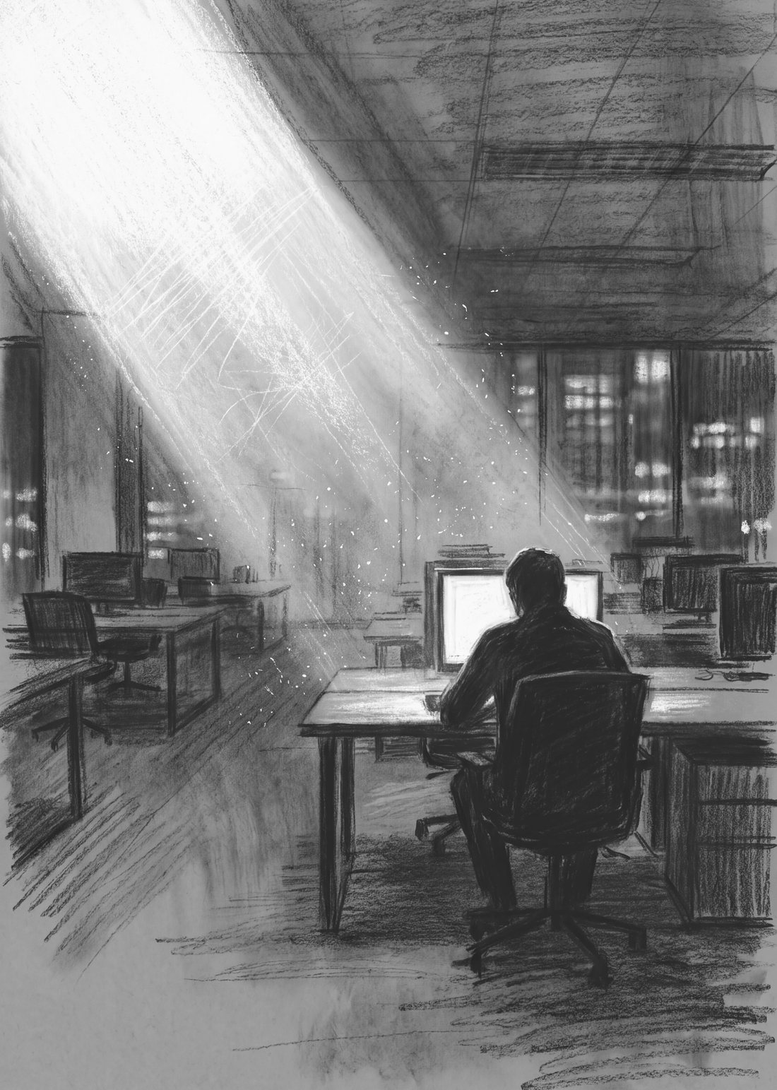
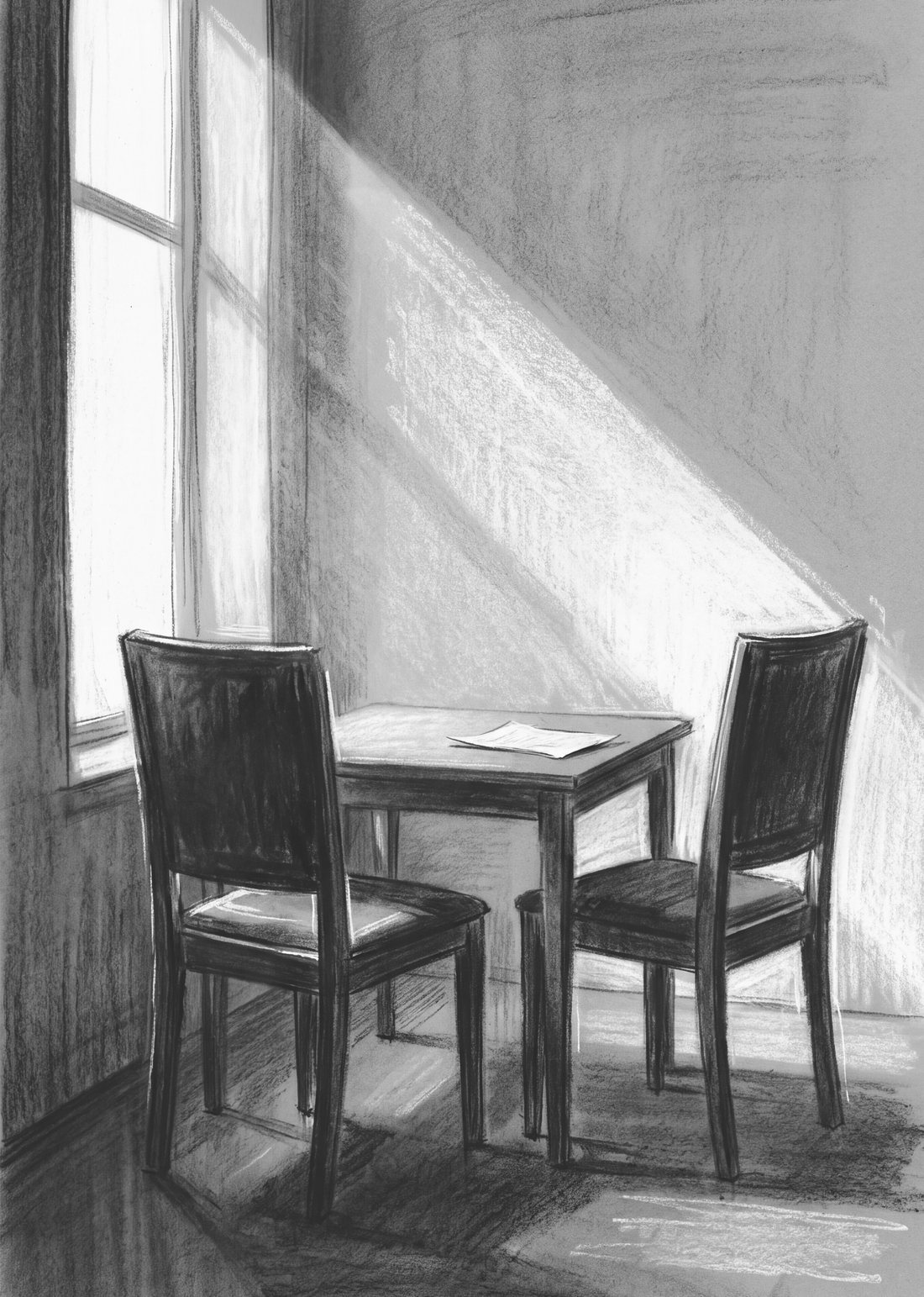
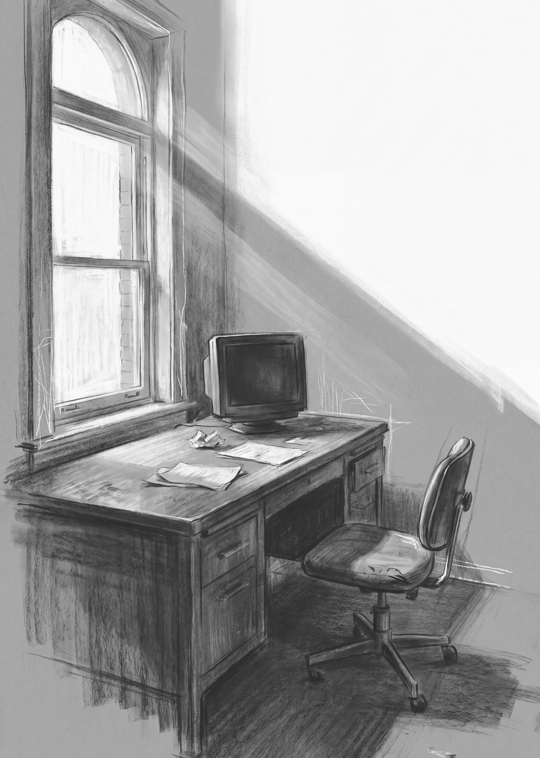
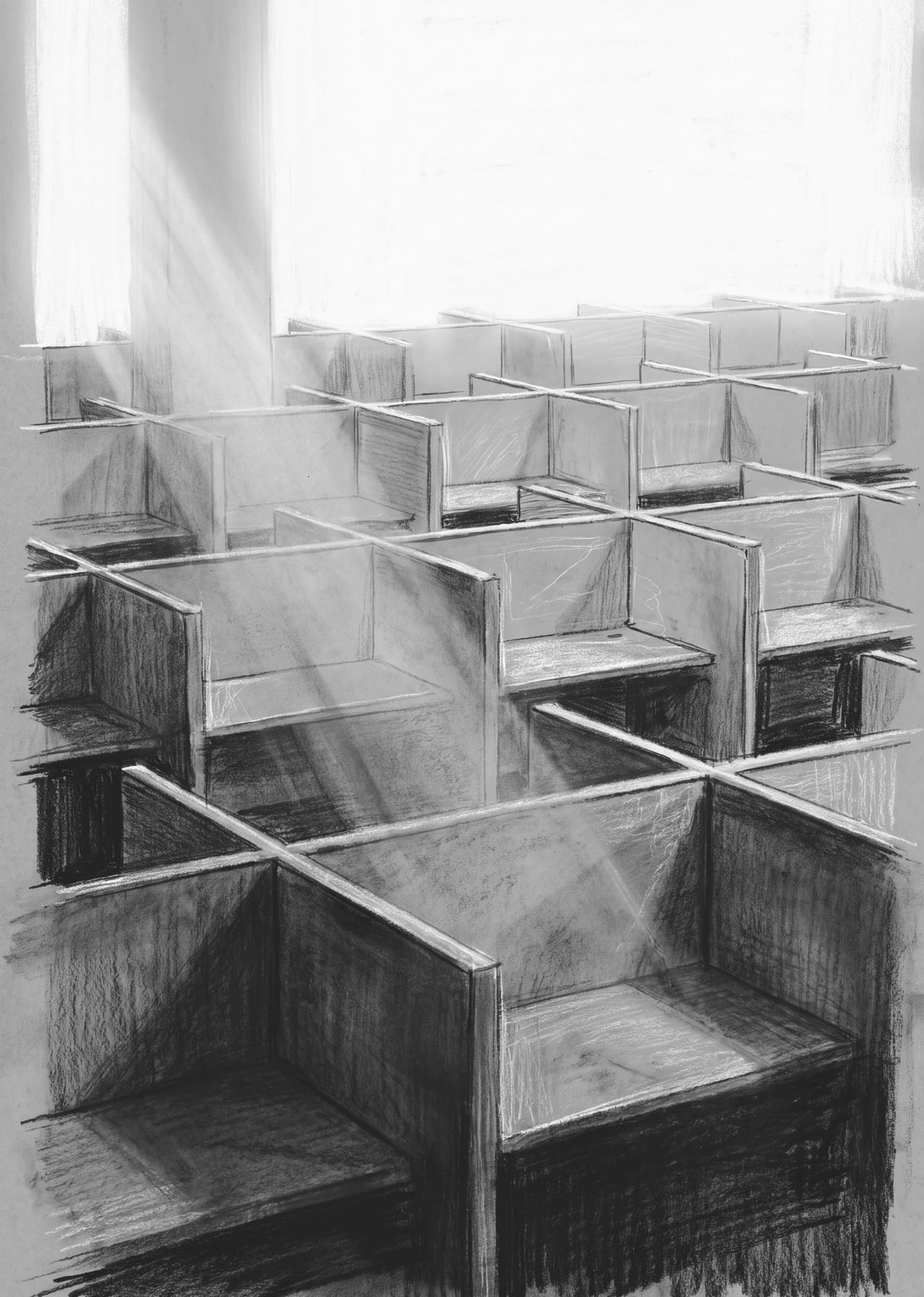
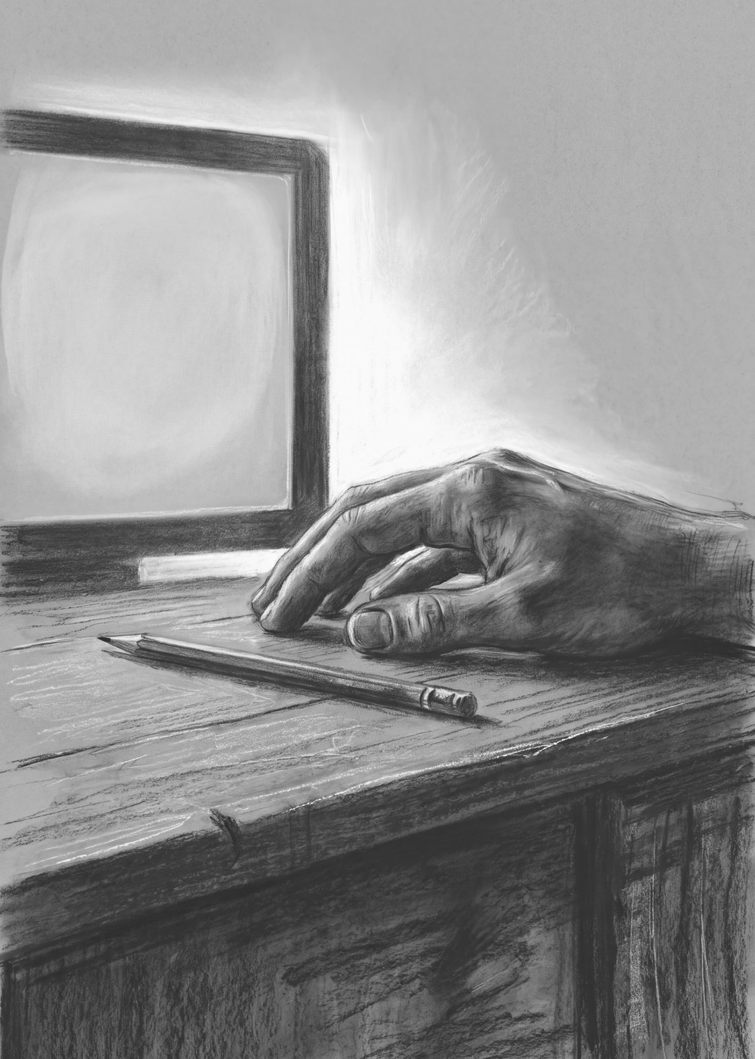
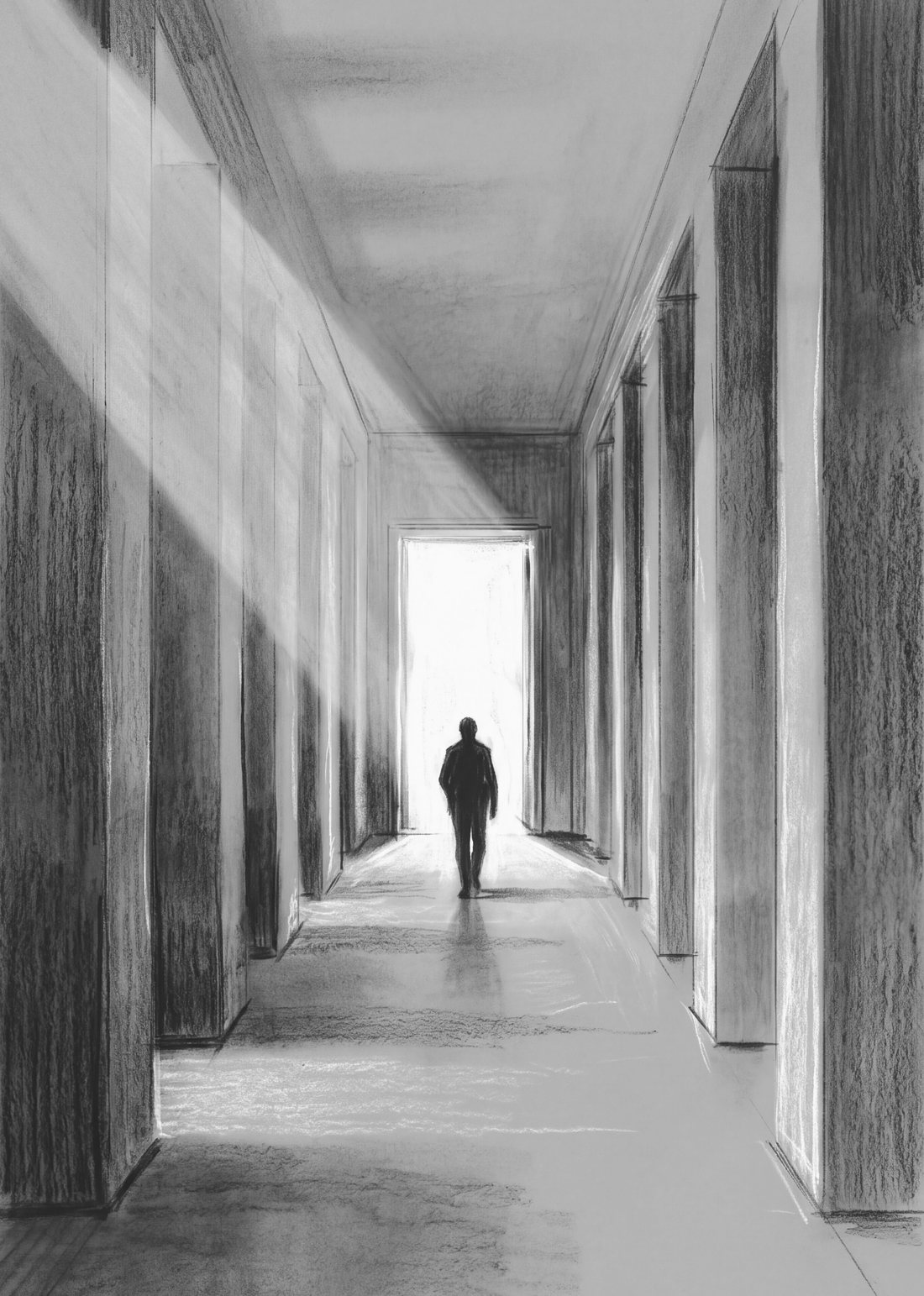
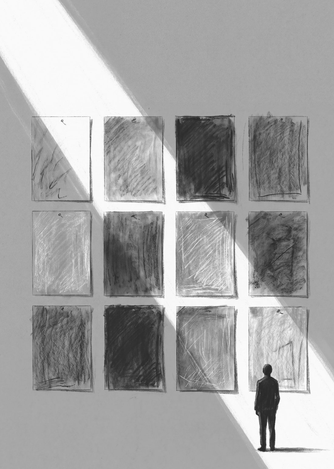
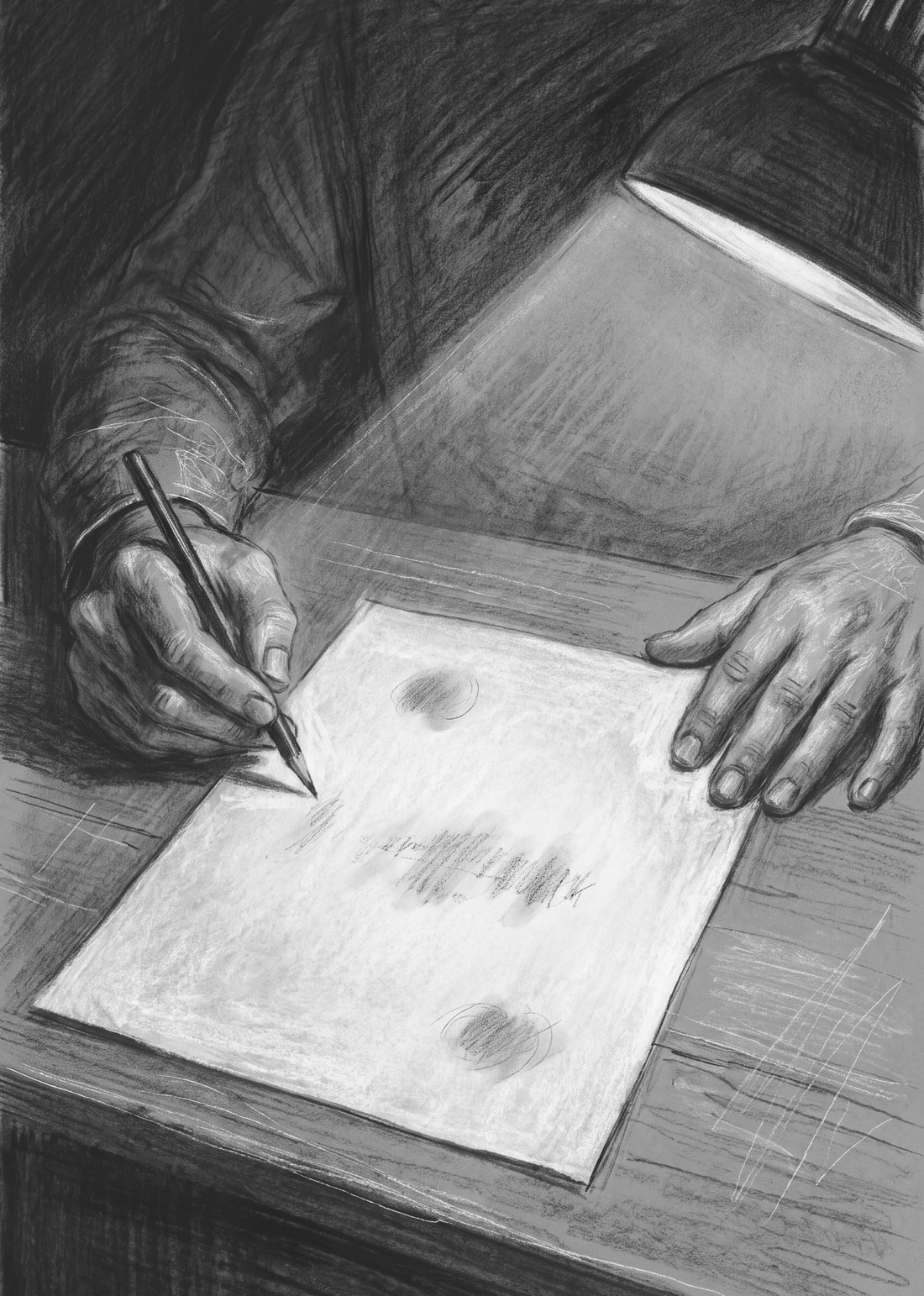
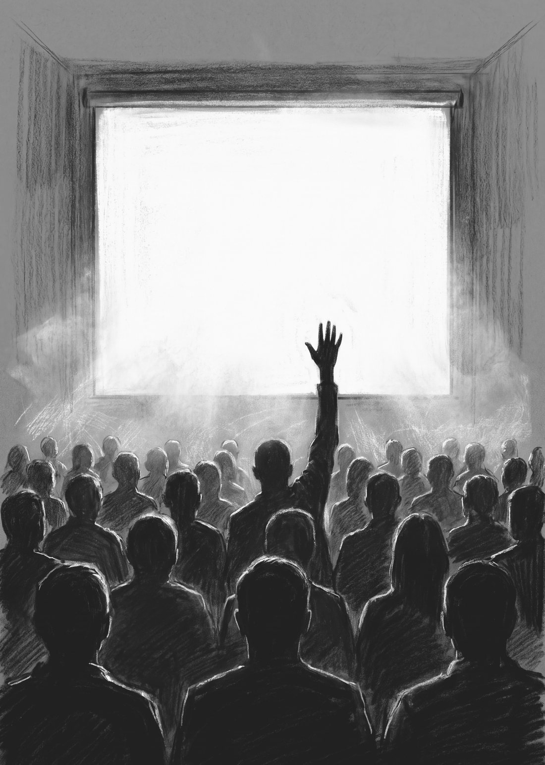
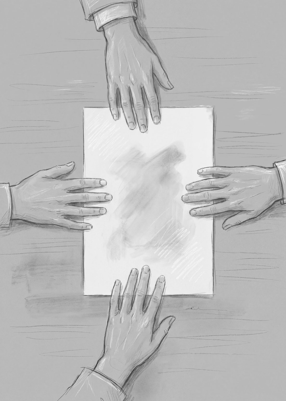
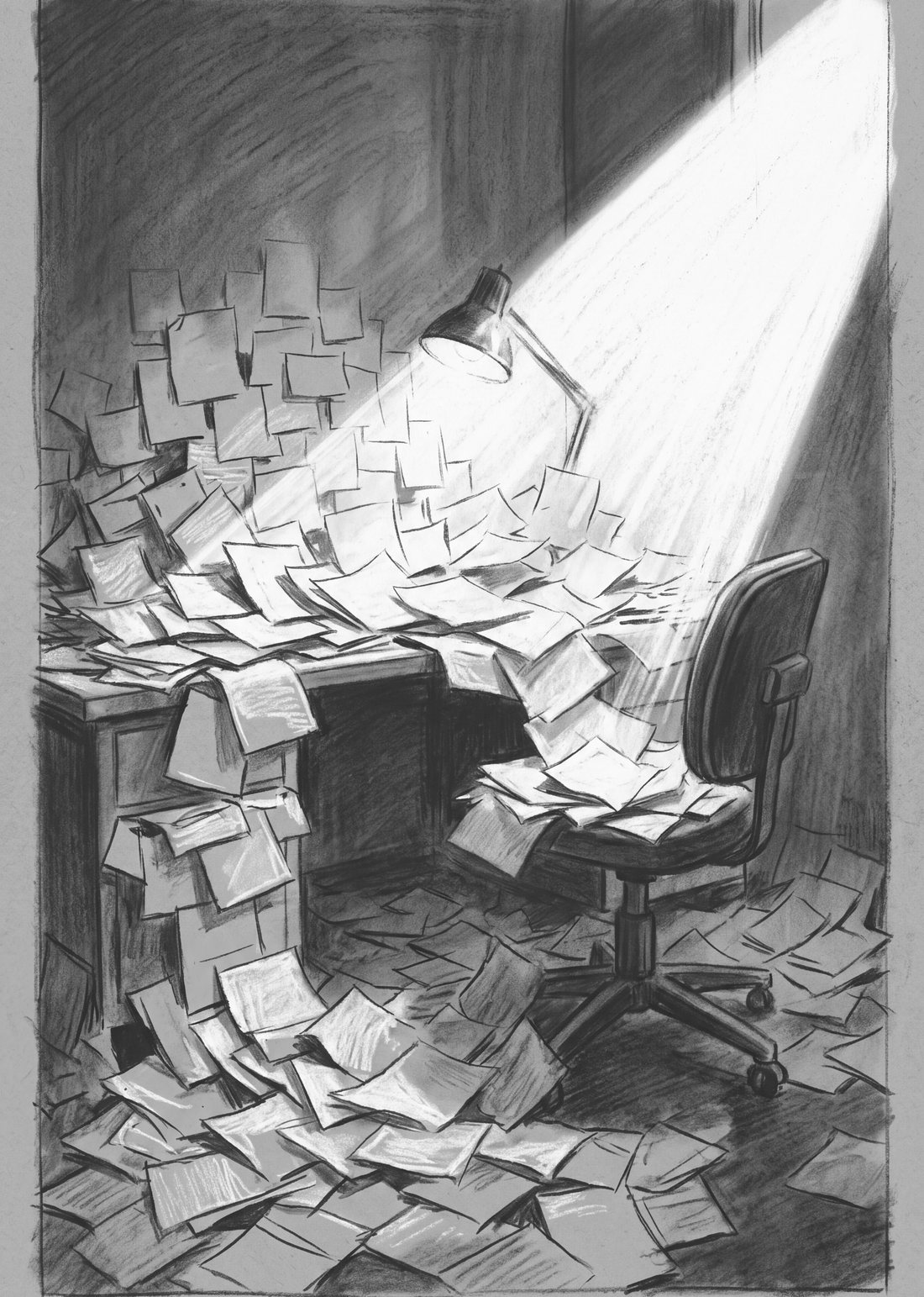
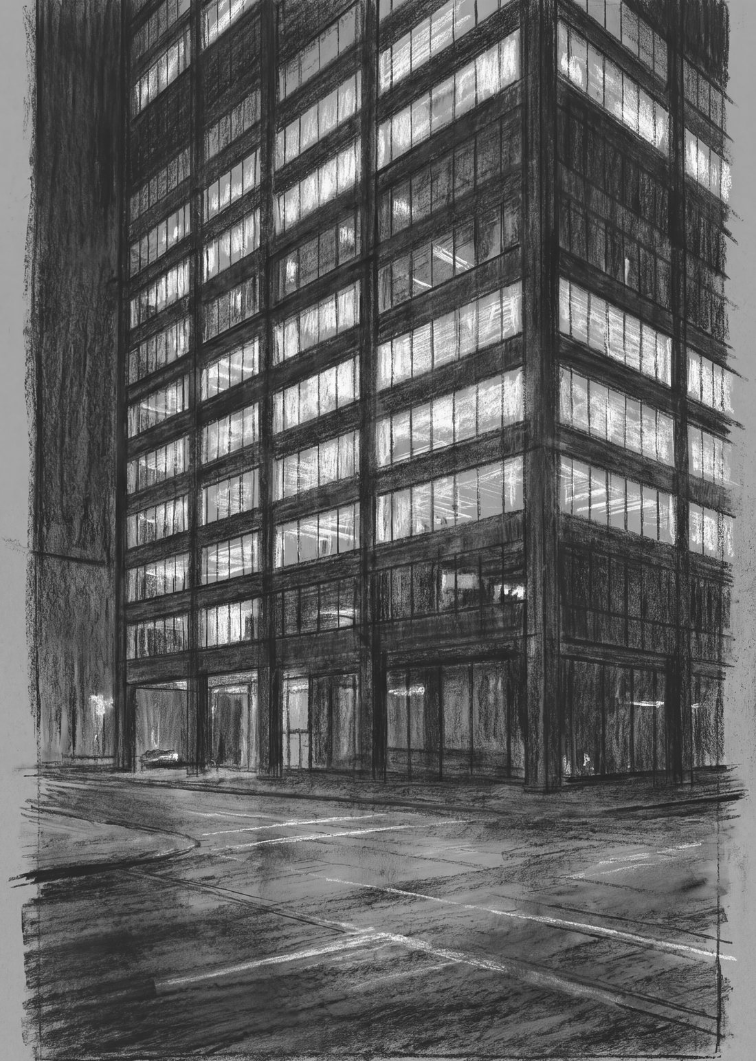
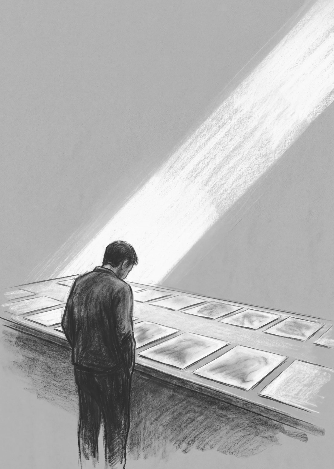
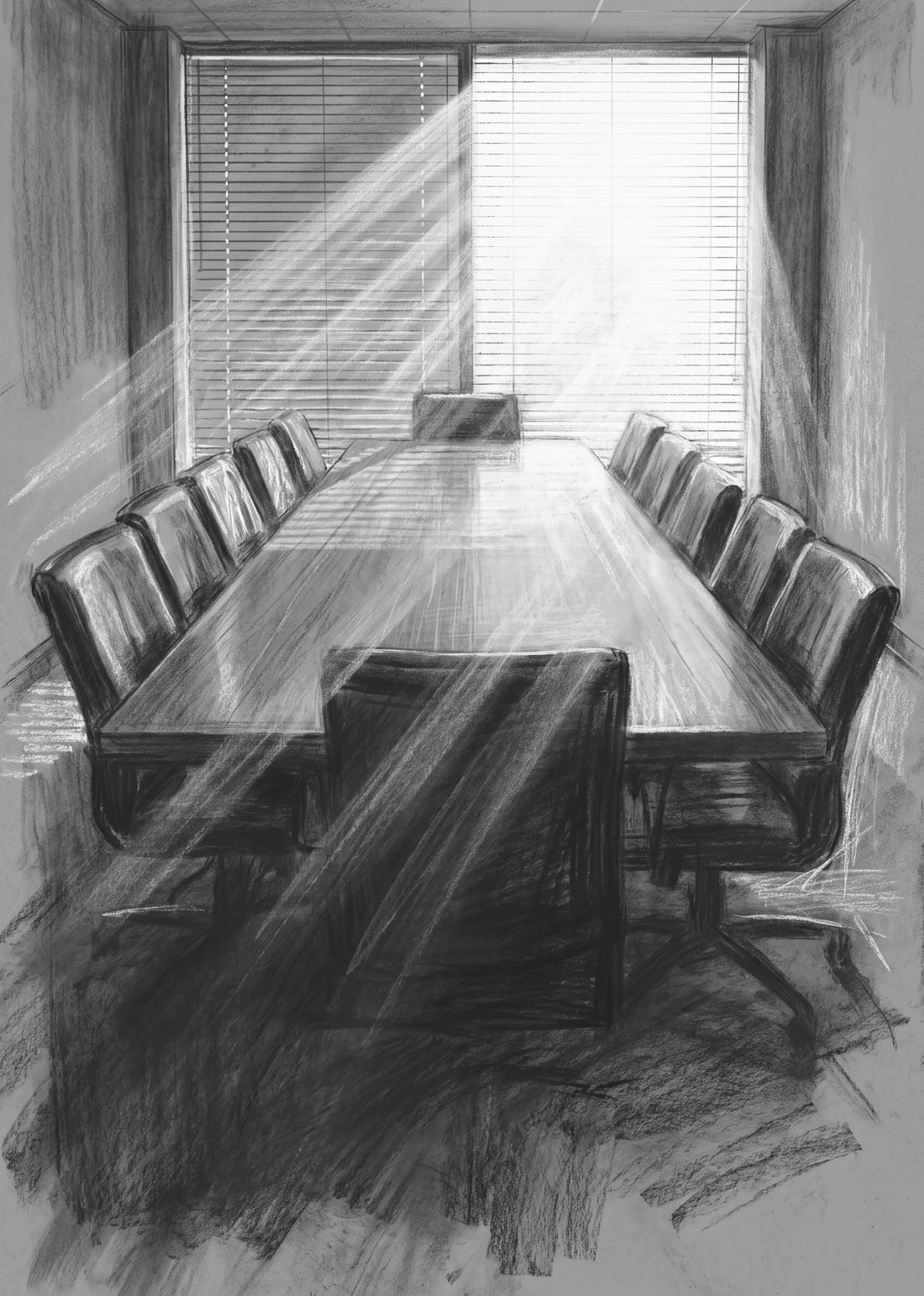
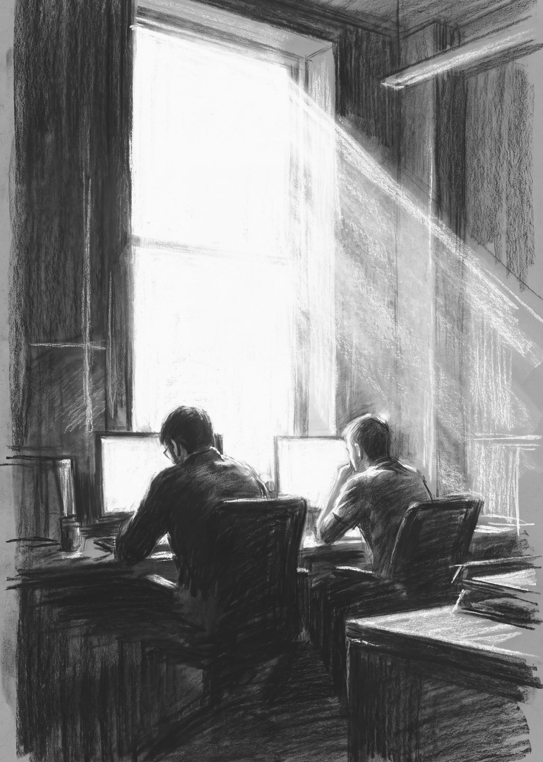
The illustrations actually printed in the book: nine chapter openers and seven full-page plates in graphite. Empty halls, lone desks and long corridors — the quiet spaces an organization leaves behind when the tools arrive before the people.
03 — FICTION

Novel illustration.

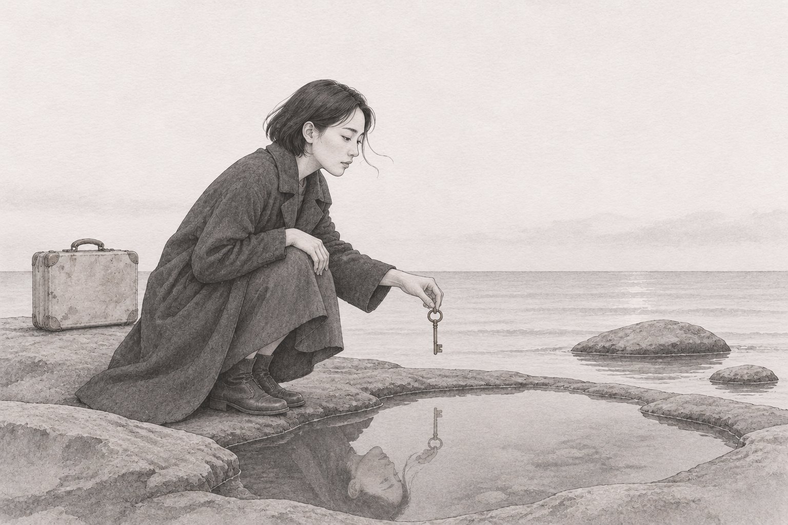
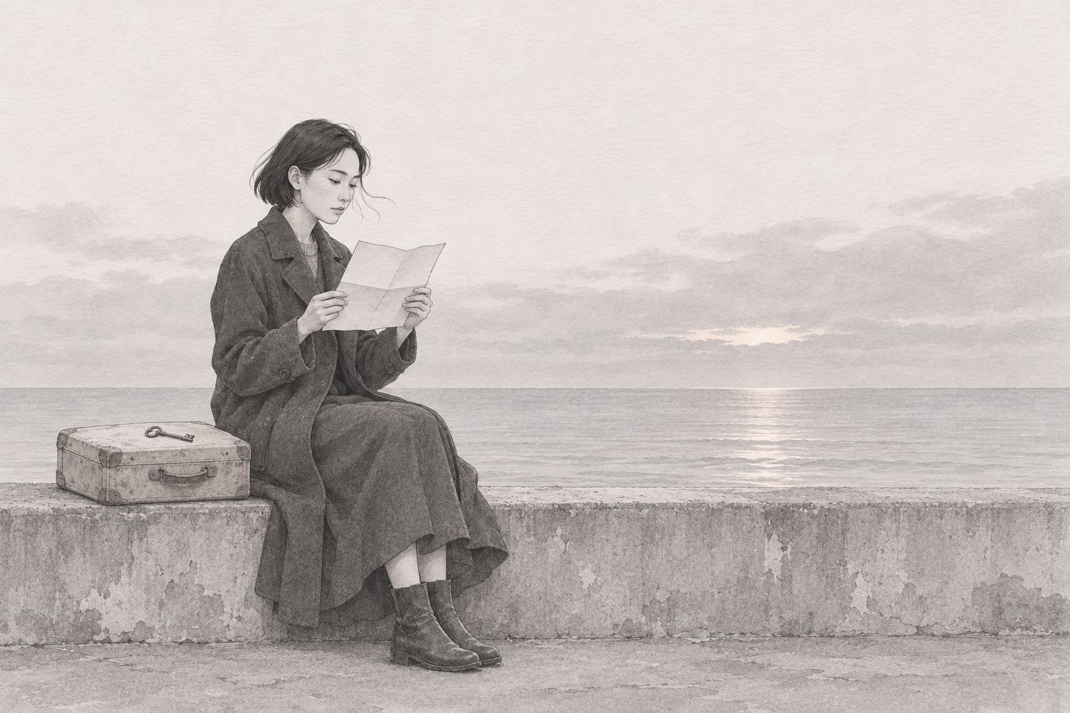
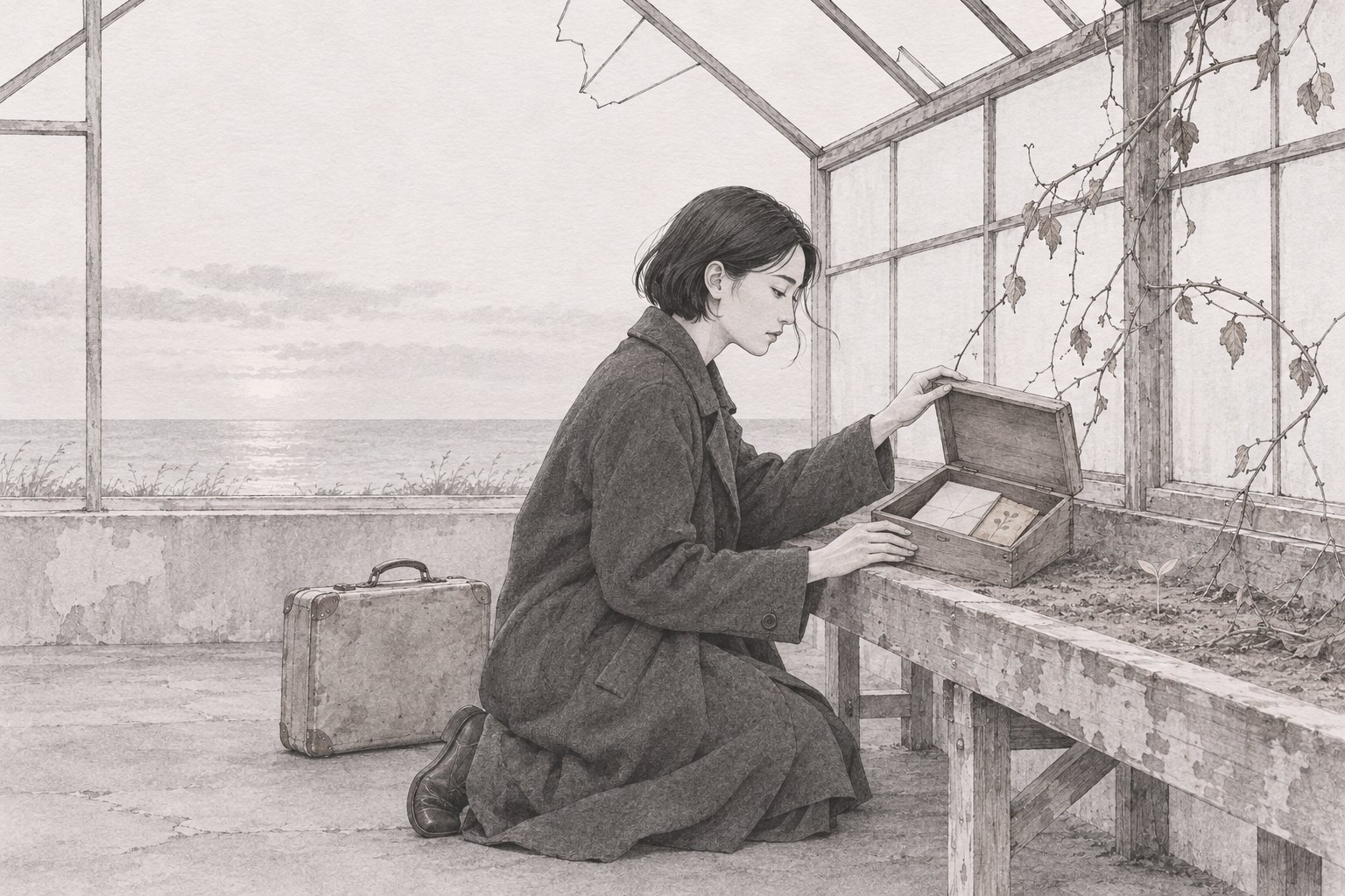
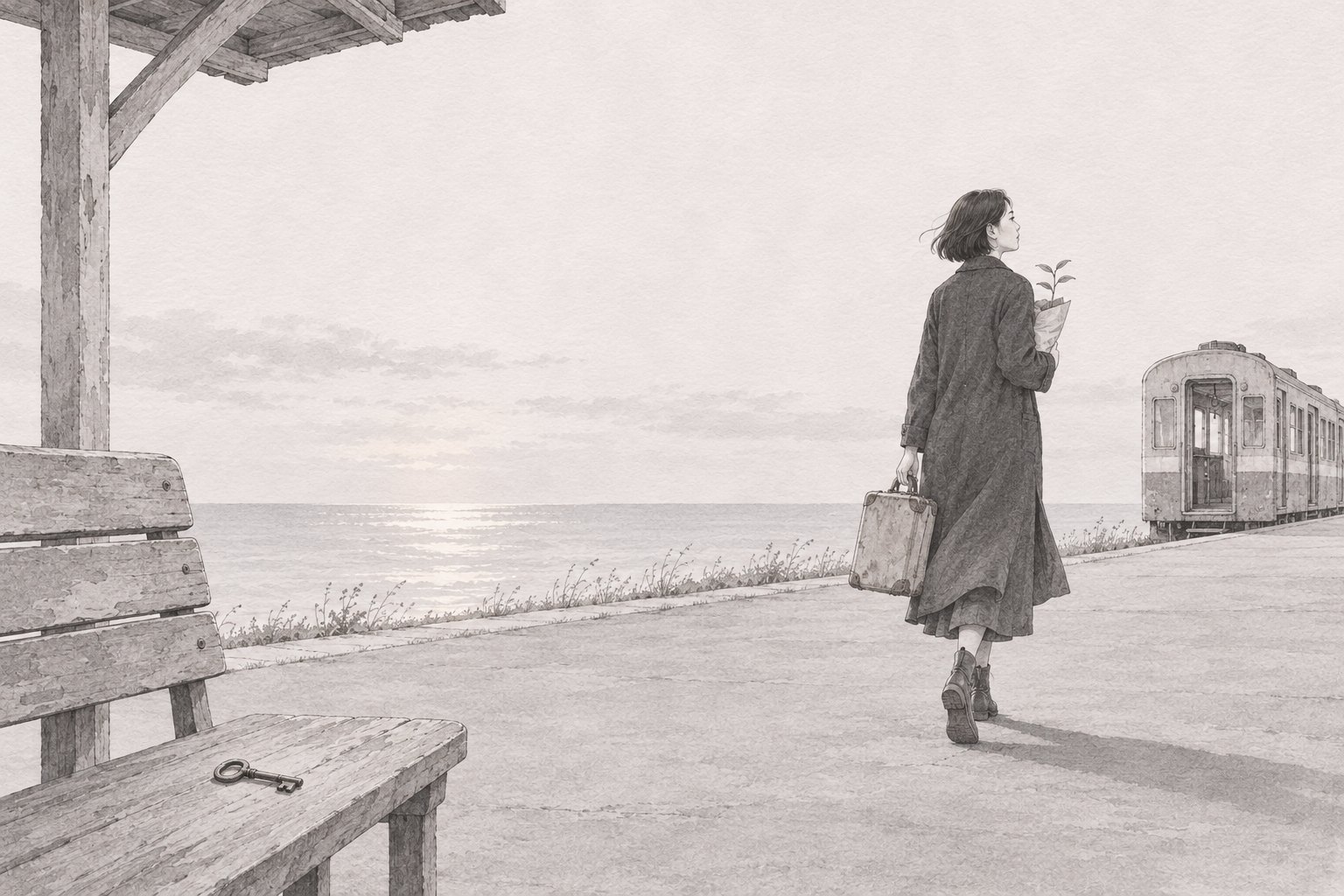
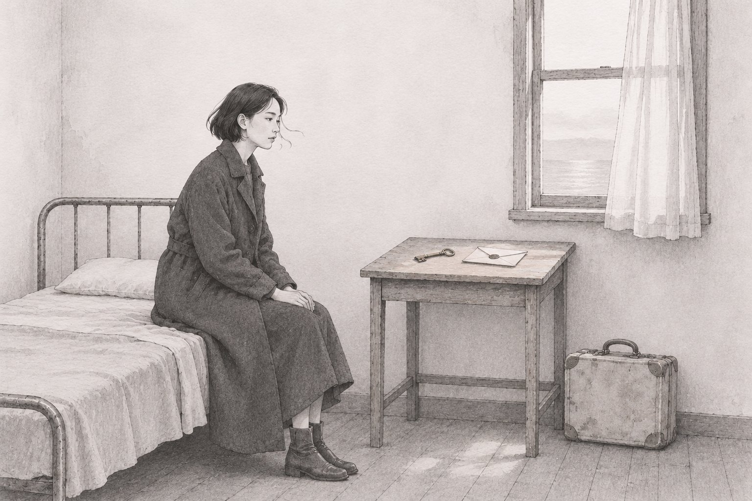
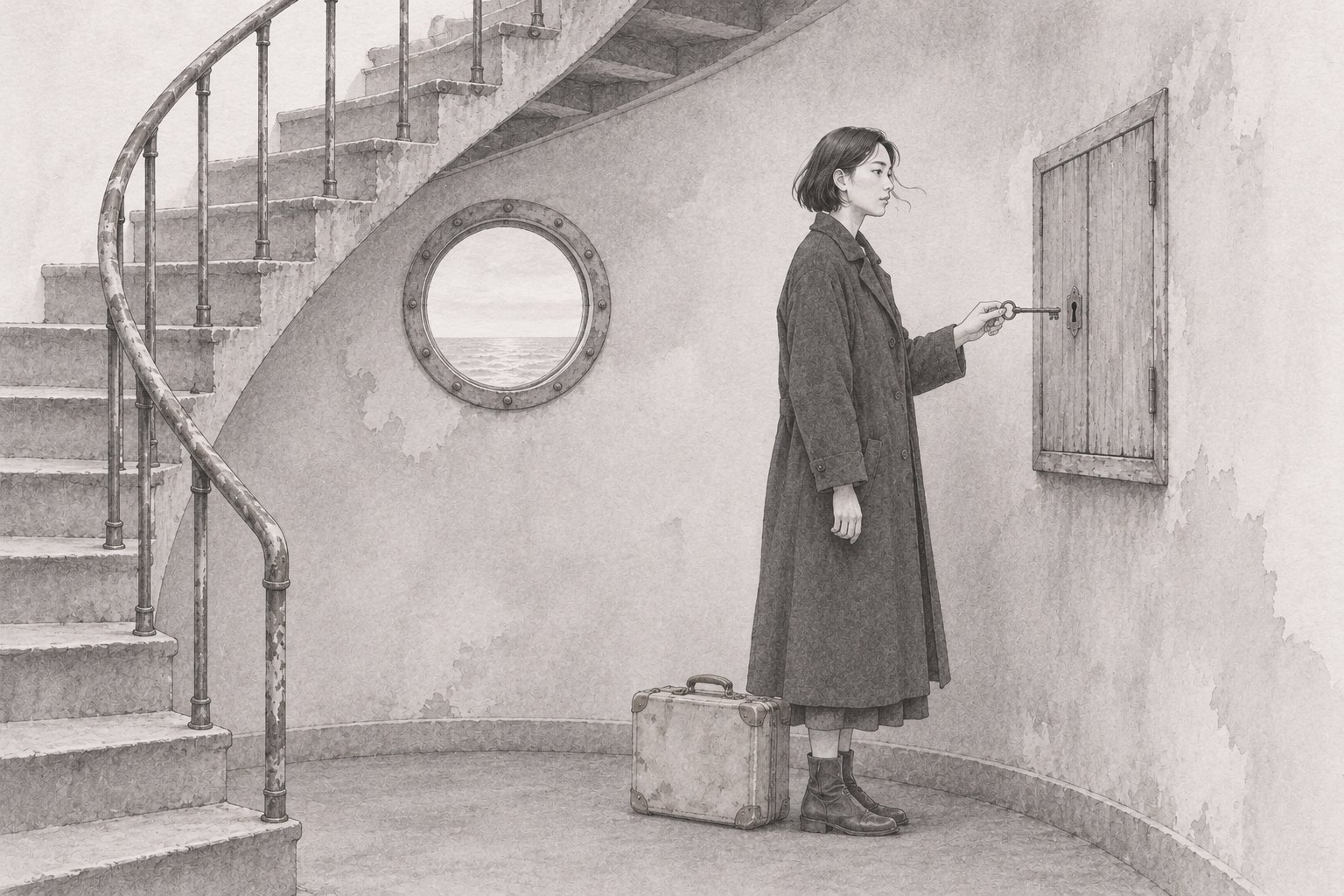
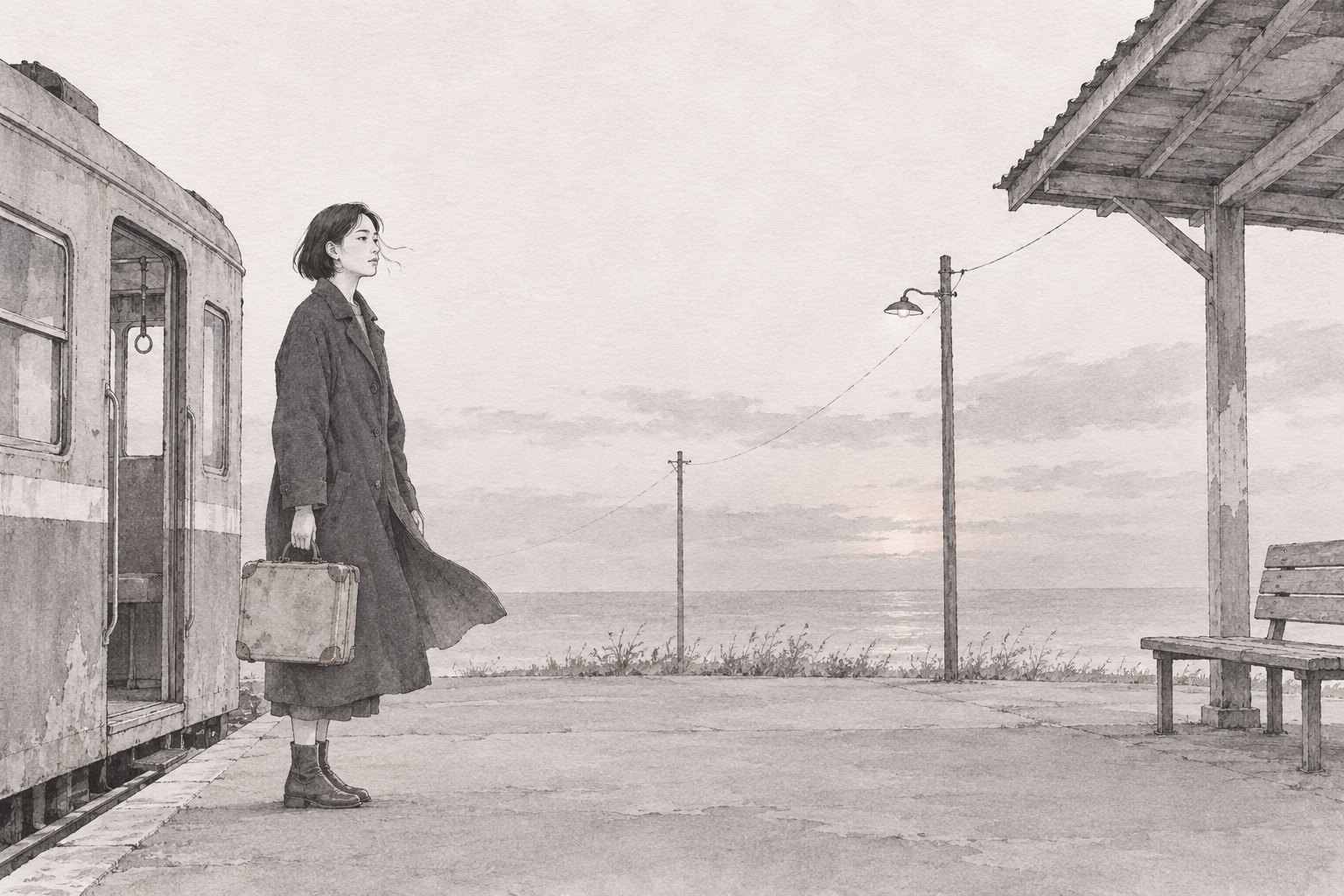
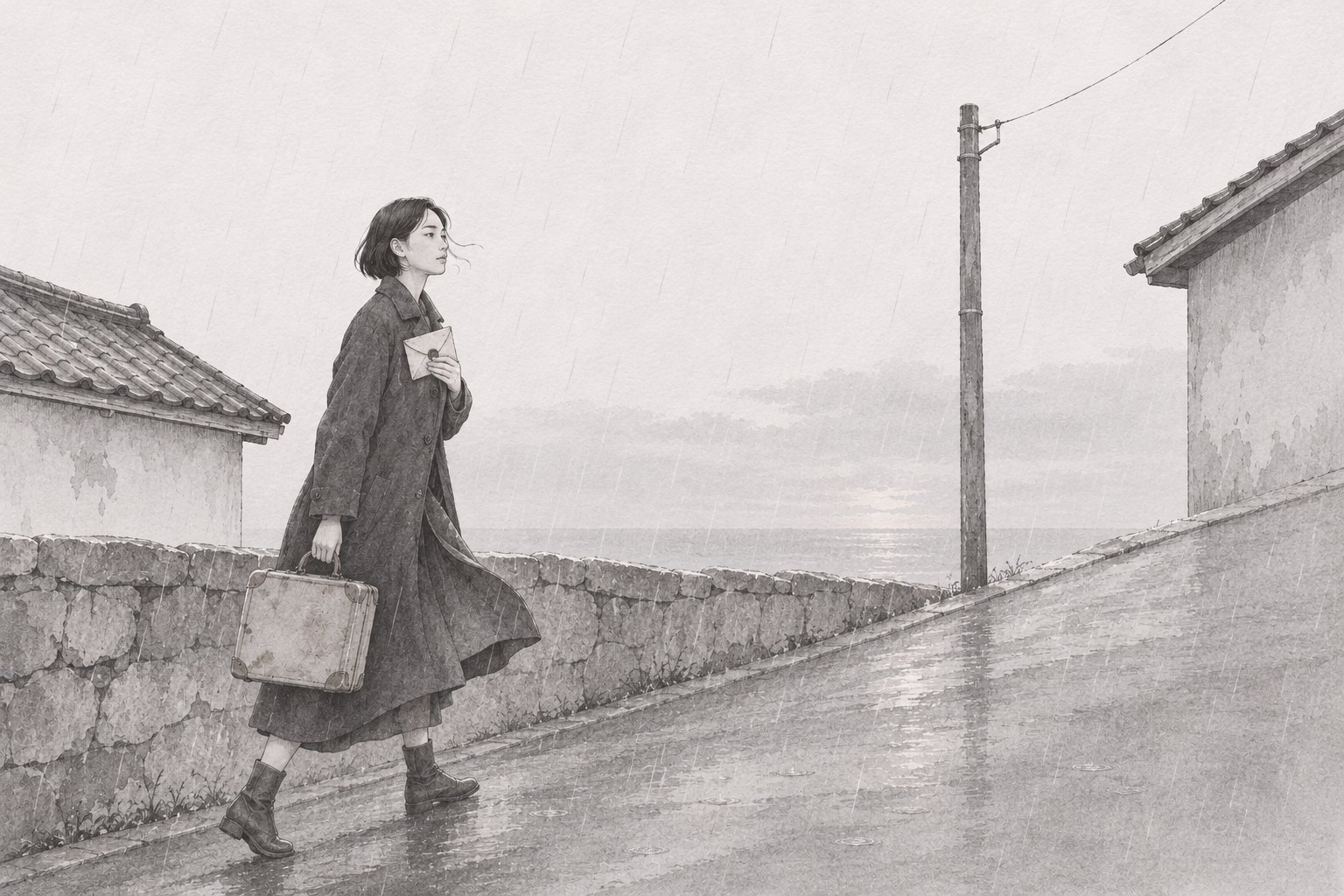
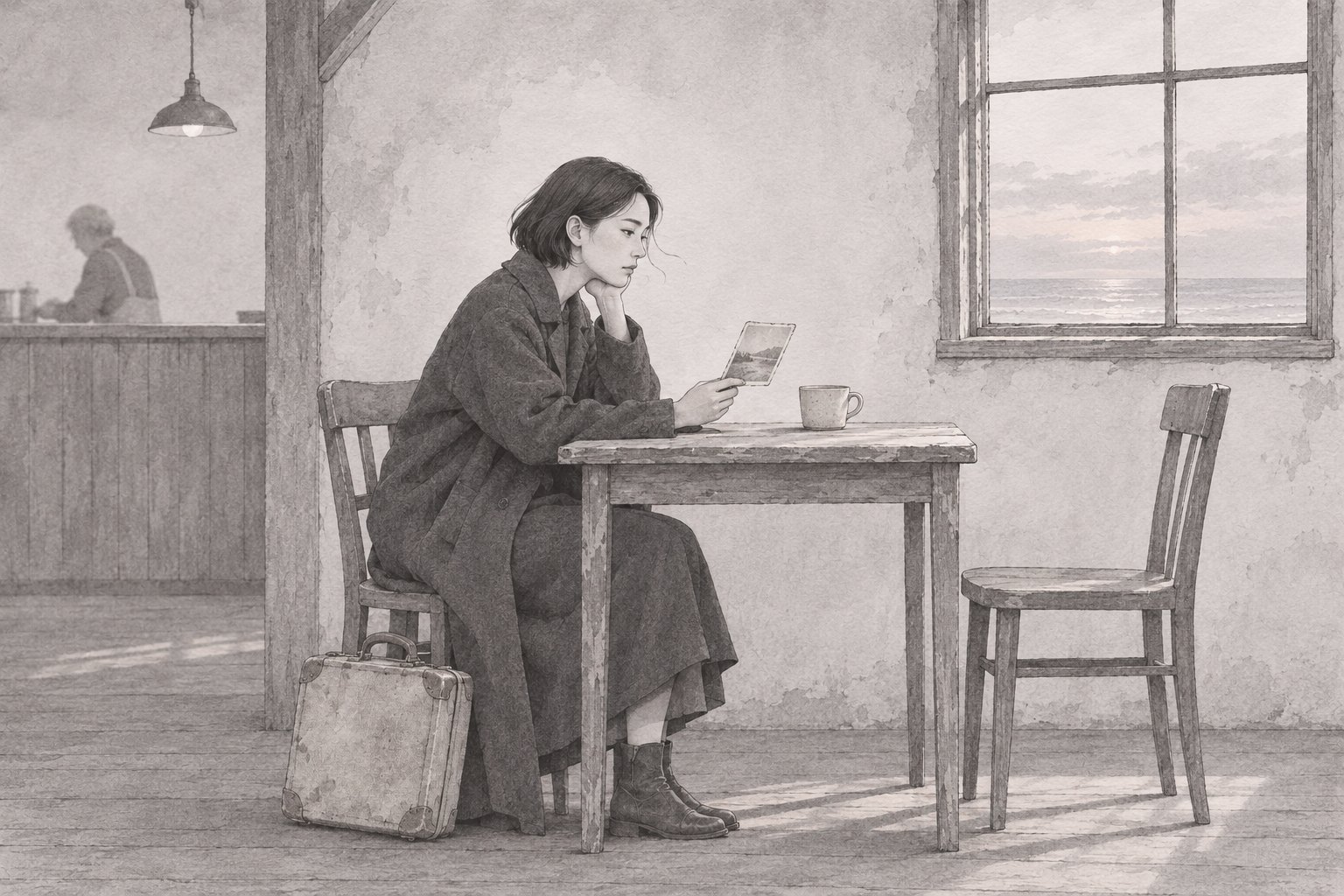
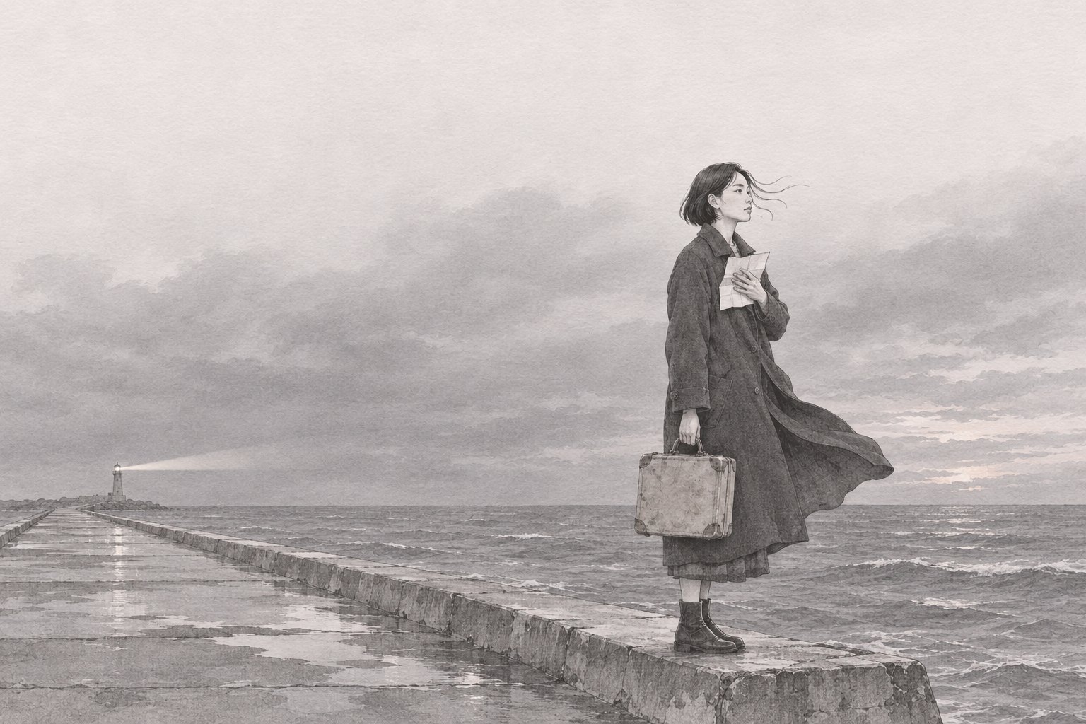
One heroine, one worn suitcase and a key, followed through ten scenes by the sea — tide pool, greenhouse, lighthouse, a last platform. Pencil and soft wash, kept in a single muted palette so the series reads as one story.

02 — SELECTED WORKS

Packaging &
Emblem Boards

Opening with MORU, a kraft packaging system carried across every panel. Then ten boards by industry, four brands per board, forty symbols in all. Each brand is laid out on one sheet — sketch → construction → refined symbol → color → application mockup — with a note on why that form and palette were chosen.

MORU kraft tea-set mailer box with a forest-green orbit printed across the panelsPACKAGE / MORU
PACKAGE 01 — MORU TEA OBJECTS

Packaging · Identity

Wordmark → color → dieline → kraft mailer → unboxing · 3 pages

A one-piece kraft mailer for a Korean tea set. One forest-green orbit runs continuously across every panel, a blind deboss marks the lid, and a molded-pulp insert replaces foam. 360 × 390 × 210 mm, 1C print, no lamination.

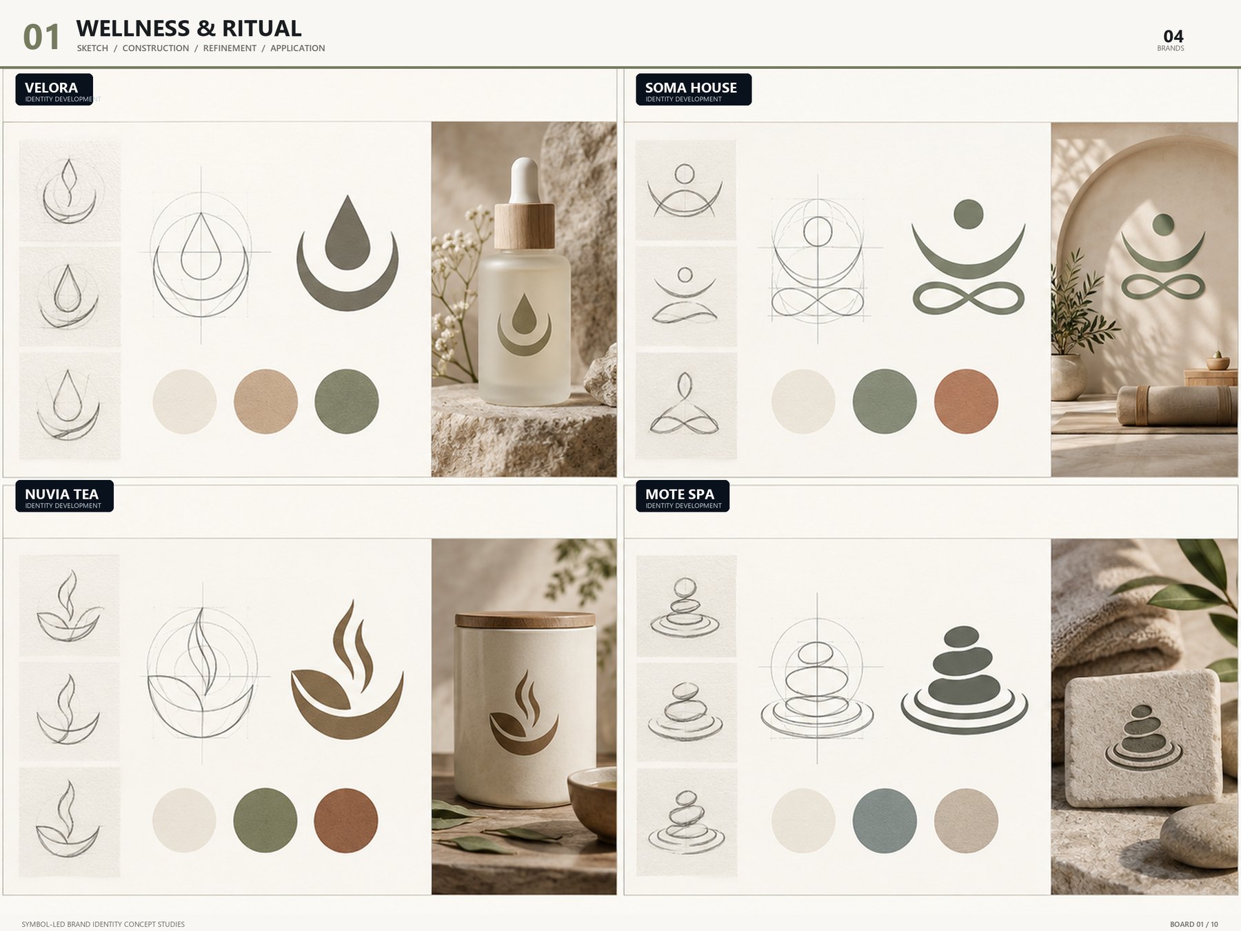
Wellness & Ritual emblem board — VELORA / SOMA HOUSE / NUVIA TEA / MOTE SPABOARD 01 / 10
BOARD 01 — WELLNESS & RITUAL

Wellness · Ritual

4 brands · sketch → construction → symbol → color → application

Slow-breathing forms — a droplet, a moon, a lotus, stacked stones. Thin lines, rounded shapes and a low-saturation palette of sand, sage and terracotta: symbols that settle quietly onto spa, tea and skincare alike.

VELORASOMA HOUSENUVIA TEAMOTE SPA
View board
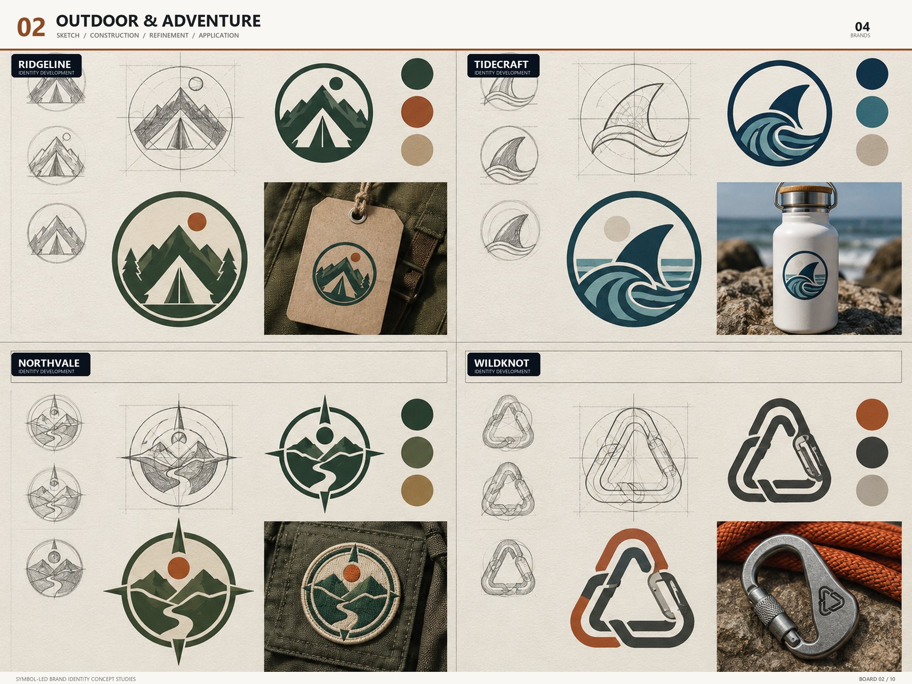
Outdoor & Adventure emblem board — RIDGELINE / TIDECRAFT / NORTHVALE / WILDKNOTBOARD 02 / 10
BOARD 02 — OUTDOOR & ADVENTURE

Outdoor · Adventure

4 brands · sketch → construction → symbol → color → application

A ridgeline, a wave, a compass and a carabiner knot, each held inside a round badge. Strokes are kept heavy for embroidery, patches and metal engraving, and every mark was tested in one color first.

RIDGELINETIDECRAFTNORTHVALEWILDKNOT
View board
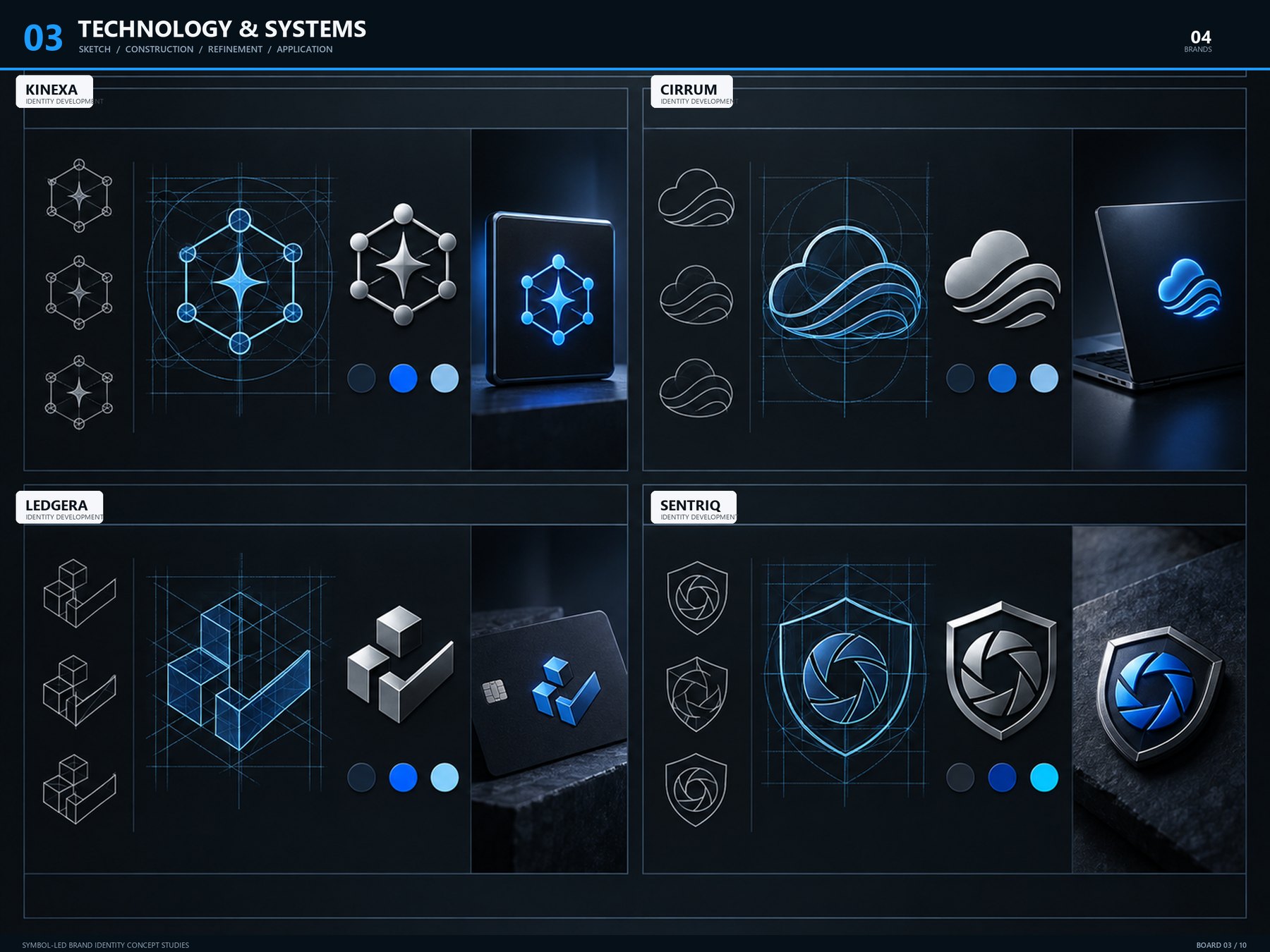
Technology & Systems emblem board — KINEXA / CIRRUM / LEDGERA / SENTRIQBOARD 03 / 10
BOARD 03 — TECHNOLOGY & SYSTEMS

Technology · Systems

4 brands · sketch → construction → symbol → color → application

Nodes and links, flow, ledger, shield — abstract concepts translated into geometry. Stroke weight and corner radius are unified for legibility in dark UI and app icons.

KINEXACIRRUMLEDGERASENTRIQ
View board
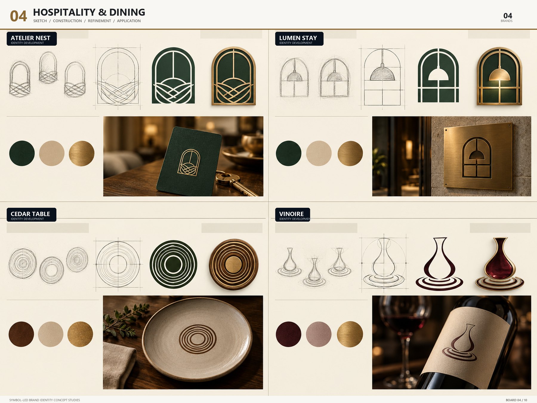
Hospitality & Dining emblem board — ATELIER NEST / LUMEN STAY / CEDAR TABLE / VINOIREBOARD 04 / 10
BOARD 04 — HOSPITALITY & DINING

Hospitality · Dining

4 brands · sketch → construction → symbol → color → application

The outlines of an arch, a window, a table and a wine glass refined into gold line work. A deep green, cream and brass palette carries the same warmth across signage, menus, key tags and business cards.

ATELIER NESTLUMEN STAYCEDAR TABLEVINOIRE
View board
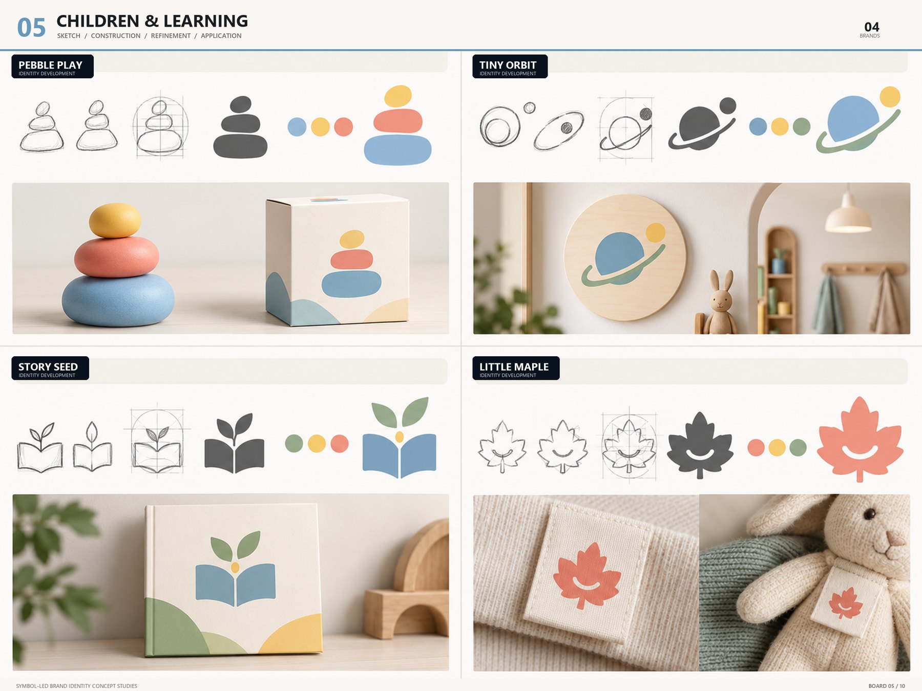
Children & Learning emblem board — PEBBLE PLAY / TINY ORBIT / STORY SEED / LITTLE MAPLEBOARD 05 / 10
BOARD 05 — CHILDREN & LEARNING

Children · Learning

4 brands · sketch → construction → symbol → color → application

A pebble, an orbit, a sprout, a maple leaf. Every corner is rounded and the primaries are turned down a notch, so the marks stay easy on the eye across textbooks and toy packaging — and keep their character at small sizes.

PEBBLE PLAYTINY ORBITSTORY SEEDLITTLE MAPLE
View board
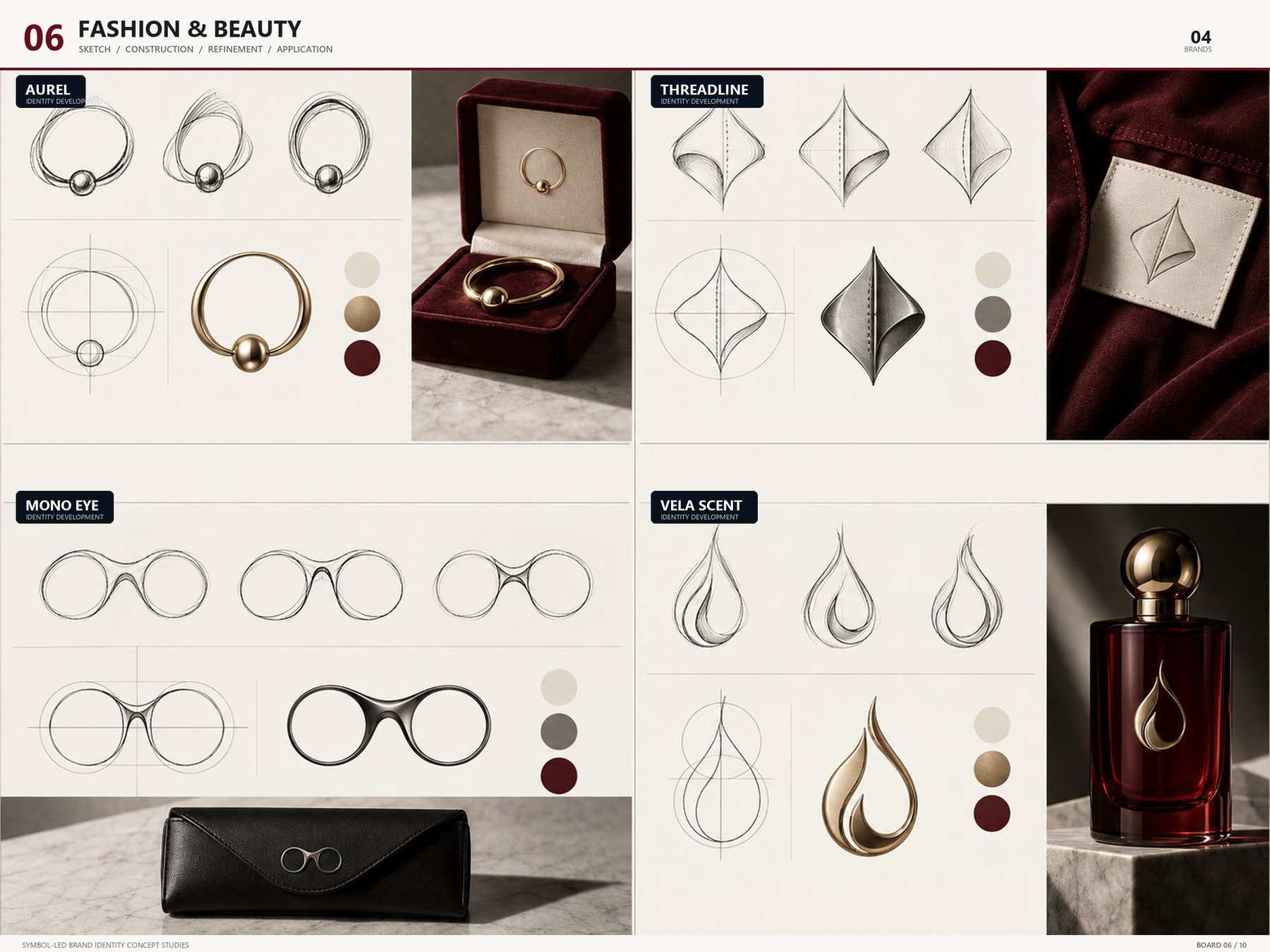
Fashion & Beauty emblem board — AUREL / THREADLINE / MONO EYE / VELA SCENTBOARD 06 / 10
BOARD 06 — FASHION & BEAUTY

Fashion · Beauty

4 brands · sketch → construction → symbol → color → application

A board of monograms and fine lines. Thread, an eye and the drift of scent reduced to the fewest strokes, applied in black, ivory and rose gold across labels, shopping bags and engraved bottles.

AURELTHREADLINEMONO EYEVELA SCENT
View board
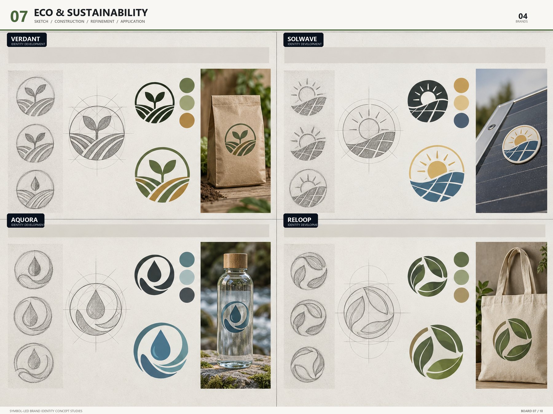
Eco & Sustainability emblem board — VERDANT / SOLWAVE / AQUORA / RELOOPBOARD 07 / 10
BOARD 07 — ECO & SUSTAINABILITY

Eco · Sustainability

4 brands · sketch → construction → symbol → color → application

A leaf, sun and wave, a droplet, a loop of arrows. The more familiar the motif, the more structure matters — circle and arc proportions are locked to a grid so the four brands read as one family.

VERDANTSOLWAVEAQUORARELOOP
View board
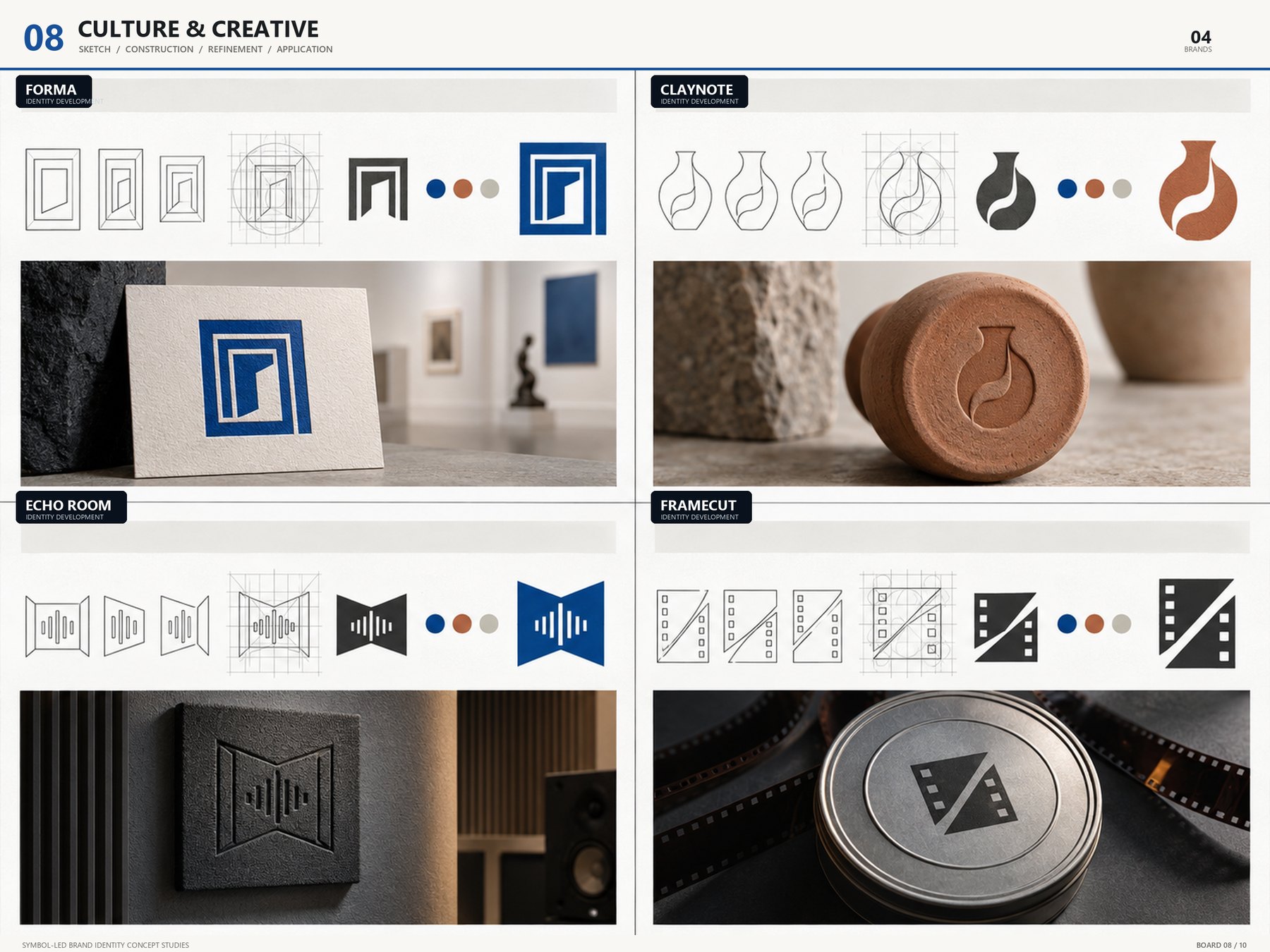
Culture & Creative emblem board — FORMA / CLAYNOTE / ECHO ROOM / FRAMECUTBOARD 08 / 10
BOARD 08 — CULTURE & CREATIVE

Culture · Creative

4 brands · sketch → construction → symbol → color → application

Four creative brands — studio, gallery, sound, film. Shapes are cut and overlapped boldly to build rhythm: symbols that gain power on large surfaces like posters and exhibition signage.

FORMACLAYNOTEECHO ROOMFRAMECUT
View board
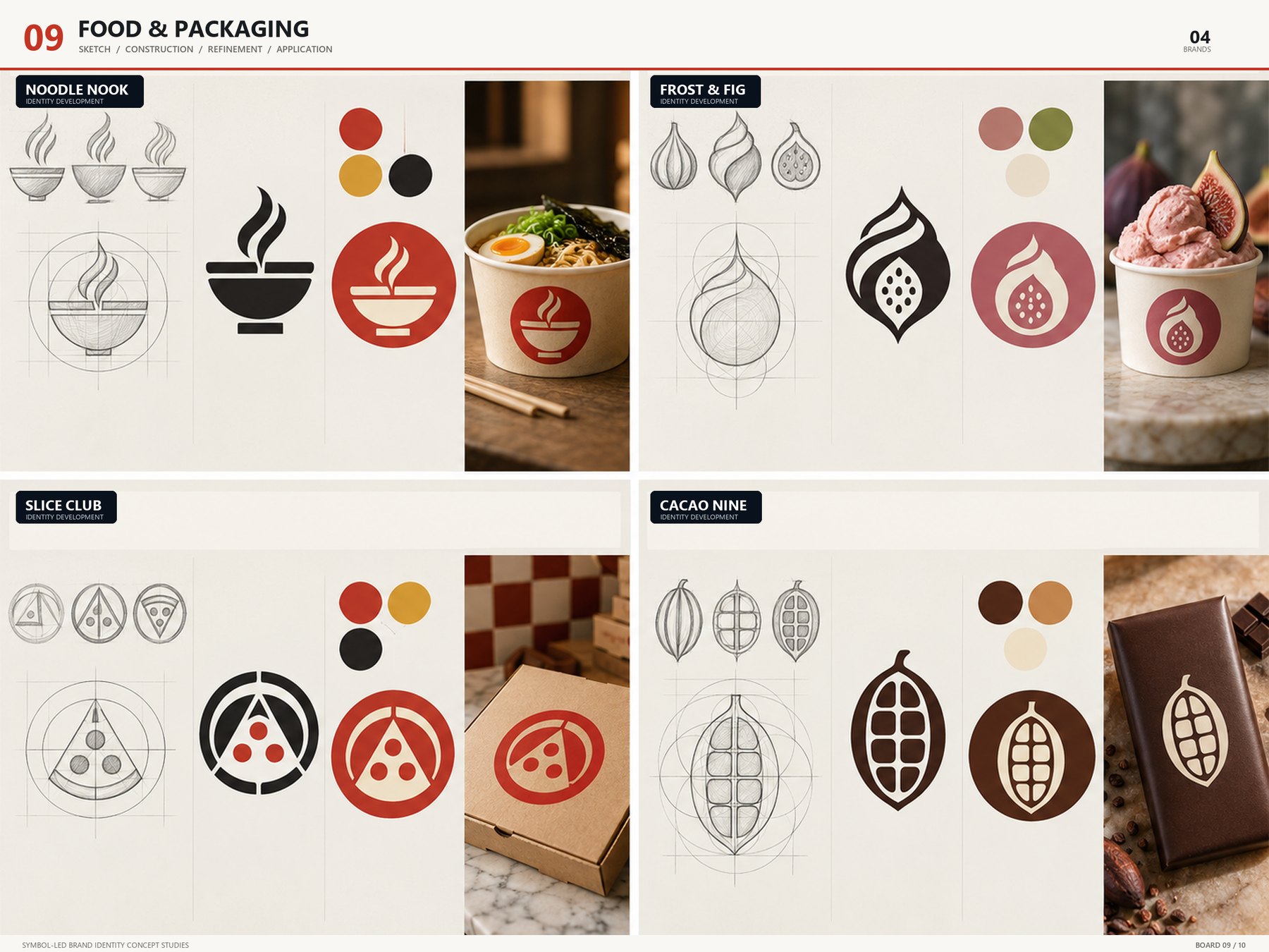
Food & Packaging emblem board — NOODLE NOOK / FROST & FIG / SLICE CLUB / CACAO NINEBOARD 09 / 10
BOARD 09 — FOOD & PACKAGING

Food · Packaging

4 brands · sketch → construction → symbol → color → application

Noodles, a fig, a pizza slice, cacao. Appetizing curves and warm color, but built from solid shapes so they reproduce cleanly in one- and two-color package printing.

NOODLE NOOKFROST & FIGSLICE CLUBCACAO NINE
View board
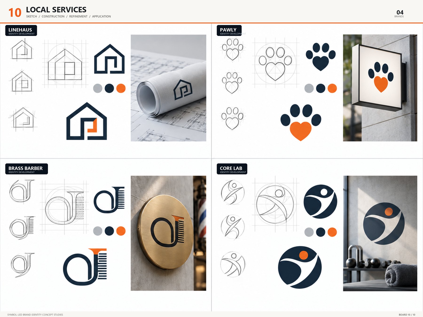
Local Services emblem board — LINEHAUS / PAWLY / BRASS BARBER / CORE LABBOARD 10 / 10
BOARD 10 — LOCAL SERVICES

Local Services

4 brands · sketch → construction → symbol → color → application

A board for neighborhood businesses — an architecture office, pet care, a barbershop, a gym. Symbol and wordmark are locked together firmly so they read at a glance on signs, door vinyl and uniform embroidery.

LINEHAUSPAWLYBRASS BARBERCORE LAB
View board
Ten boards · forty brands. Click any image to enlarge. All marks are portfolio concepts; a delivered logo goes through vector rework and a trademark search once a direction is chosen.
03 — PROCESS

From sketch
to seal.

Choose a direction first, then refine only that one in depth. Every stage is shared as a single board, so you always see where we are.

01

Brief & Research

We listen for the brand name, industry, intended tone and what to avoid, and review competitor symbols together.

Day 0
02

Three Sketches

Three symbol sketches in distinct directions, shared as a board. One direction is chosen here.

Day 2–3
03

Construction & Refinement

The chosen mark is refined on grid and construction lines, then paired with a color palette and wordmark. Two revision rounds included.

Day 4–7
04

Application & Vector Delivery

Application mockups, a mini guide and AI · SVG · PDF · PNG masters, delivered with commercial usage rights.

Delivery
04 — WHY BUGFEATURES

A symbol that survives
being printed small.

Every project is handled personally by our founder, an art director with 20 years at NCSOFT and Krafton. Having built visual identities for games and brands countless times, the standard is not a pretty picture on screen but a symbol that holds up on a business card, a sign and an app icon.

A
Symbol first, letters later

We first make a form that is recognizable without the name. Wordmark and color are added once the symbol stands on its own.

B
Hyper visual pipeline

Our own image pipeline runs several directions a day, from sketch to application mockup. Three options compared in two days.

C
Tested per medium

Checked in advance in one color, reversed, at 16 px, engraved and embroidered. It has to leave the same impression wherever it lands.

D
Speed only a small studio can offer

No middle managers — you talk directly with the founder. Feedback goes straight into the next board.

05 — CONTACT

Tell us about
your project.

EmailCEO@bugfeatures.com
StudioBundang-gu, Seongnam-si, Gyeonggi-do, South Korea
CompanyBugFeatures MARQUE · CEO Kyu Suk Seo
Business No.Business Reg. No. 226-19-52612
Your inquiry is received immediately. Quotes are returned within 24 hours.
×